Thursday, December 31, 2009

Jonathan Strange & Mr. Norrell

I am reading a wonderful novel, Jonathan Strange & Mr. Norrell, written by Susanna Clarke. It is a tale of history and magic set at the beginning of the nineteenth century in England. The book has a delightful Dickensian descriptive turn combined with a fantasy element similar to that of the Harry Potter series. The reason I am writing about this book in this blog is that in a number of places Ms. Clarke uses prints and printsellers in a very appropriate manner.

For instance, in describing one of the main characters of the book she writes:
Nothing was more characteristic of Sir Walter Pole than Surprize. His eyes grew large, his eyebrows rose half an inch upon his face and he leant suddenly backwards and altogether he resembled nothing so much as a figure in the engravings of Mr. Rowlandson and Mr. Gillray.
This reference is the work of two important British caricaturists of the period, Thomas Rowlandson and James Gillray.

James Gillray (1757-1815) was a master caricaturist who began his career as an engraver. Gillray issued hundreds of social and political caricatures, including numerous biting images of George III and Napoleon. His artistic skill, wit and understanding of human nature make his images as delightful, pointed and scandalous today as they were when issued. His influence, both socially and politically, was substantial. The late eighteenth and early nineteenth century was a time of considerable political discord and mutual hate between the opposing parties (remind you of today at all?), and Gillray's caricatures fit into this environment perfectly.

Most of Gillray's prints were published and sold by Miss Hannah Humphrey from her print shop (illustrated in the Gillray image above). Their relationship went well beyond business, for they lived together for many years and supposedly were once on the way to the church to get married when Gillray stopped and said, "This is a foolish affair, methinks, Miss Humphrey. We live very comfortably together; we had better let well alone."

Gillray's contemporary, Thomas Rowlandson (1756-1827), was also a brilliant caricaturist, but with a more gentle soul. He trained at the Royal Academy Schools and in Paris, but upon receiving a substantial legacy he plunged into the decadent life common of the wealthy British "gentleman." Meanwhile he turned himself into an expert caricaturist, lampooning the excesses of society in which he now endulged. His sharp eye, comic renderings, and delicate use of color soon established him as one of the important English artists of his period.

The prints of both of these artists were well known by the social elite in England during the period of Jonathan Strange & Mr. Norrell, so it is very appropriate that Ms. Clarke used their work to help describe Sir Pole.

Besides caricatures, portraits of famous individuals were very popular. Before the day of illustrated newspapers and photography, engraved portraits were the only way that the general public could learn what the royalty, politicians, and heroes of the era looked like. Ms. Clarke notes this in a passage about Lord Wellington,
How to describe Lord Wellington? How can such a thing be necessary or even possible? His face is everywhere one looks--a cheap print upon the wall of the coaching inn---a muich more elaborate one, embellished with flags and drums at the top of the Assembly-room staircase. Nowadays no young lady of average romantic feeling will reach the age of seventeen without purchasing at least one picture of him.

It was not only through caricatures and portraits, however, that prints had an impact on this period, for with the rise of an educated elite with both money and leisure time, prints were becoming very much part of British society. Prints not only lampooned social and political figures, but also were a means for those in society to become aware of current tastes in fashion and design.

This is nicely demonstrated in this book (Ms. Clarke obviously understood the importance of prints at the time), with a description of how Mr. Drawlight instructed Nr. Morrell, who was just moving into London society, on how to decorate his new house.
Mr. Drawlight ordered Mr. Norrell's carriage to be got ready and directed Davey to take him and Mr. Norrell straight to Mr. Ackermann's shop [Rudolph Ackermann's print shop] in the Strand. There Mr. Drawlight shewed Mr. Norrell a book which contained a picture [an aquatint] by Mr. Repton of an empty, old-fashioned parlour...But on the next page, ah! what changes had been wrought by the noble arts of joinery, paper-hanging and upholstery. Here was a picture of the same parlour, new-furnished and improved beyond all recognition!"

This quote introduces another very important figure in British prints of this period, Rudolph Ackermann, and soon I'll post a blog on this printseller and publisher.

Tuesday, December 29, 2009

Printmaking Nomenclature & Abbreviations

One of the great things about prints is that they often contain a lot of information about themselves printed right on the print, usually in the space just under the image. This usually includes the title, but also often the artist, publisher, place of publication, date of publication, and printmaker. The only problem is that sometimes the terms used to identify this information is abbreviated, written in a language other than English, or both. To help readers understand this information, I will list (alphabetically) some of the abbreviations and terms one can find on antique prints.

  • A.f.
    Etched by

  • A.P.
    Artist’s proof

  • Appresso
    Published by

  • Apud
    Published by

  • Aquaforti fecit, aquaforti, Aquaf., Aq.
    Etched by

  • Aquatinta, aq:tinta
    Aquatinted by

  • A.V.
    Augusta Vindelicorum; that is, published in Augsburg, Germany

  • Bon à tirer, B.A.T.
    Proof print for use by the printer

  • Caelavit, cael.
    Engraved by

  • Chez
    At the house of

  • Composuit
    Drawn by, referring to drawing from which the engraver, lithographer, etc. worked

  • Cum privilegio
    Privilege to publish from some authority

  • Delineavit, delin., delt., del.
    Drawn by (cf. composuit)

  • Descripsit
    Drawn by (cf. composuit)

  • Designavit, desig.
    Drawn by (cf. composuit)

  • Dessiné
    Drawn by (cf. composuit)

  • Direxit, direx.
    Directed by (head of workshop)

  • Divulgavit, divulg.
    Published by

  • Dressé
    Drawn by (cf. composuit)

  • Écrit
    Written by (lettering)

  • Effigiavit, effig.
    Drawn by (cf. composuit)

  • Engd., Eng.
    Engraved by

  • Épreuve d’Artiste, E.A.
    Artist’s proof

  • Ex coll.
    From the collection of

  • Excudit, excud., exct., exc.
    Printed by or published by

  • Ex Officina
    From the workshop of

  • Ex Typis
    From the printing house of

  • Faciebat, fac.
    Made by

  • Fecit, fec., f.
    Made by

  • Figuravit, fig.
    Drawn by (usually after an original painting)

  • Formis
    At the press of

  • Gezeichnet, gez.
    Drawn by (cf. composuit)

  • Gravé
    Engraved by

  • Gravire
    Engraving

  • Hors Commerce, H.C.
    Not for sale

  • Impressit, imp.
    Printed by

  • Incidit, incidebat, incid., inc.
    Engraved by

  • Inventor, invenit, invt., inv., in.
    Designed by (the original work)

  • Lithog., litho., lith.
    Lithographed by (either drawn on stone a publisher)

  • On stone by
    Drawn on lithographic stone by

  • Par
    By

  • Pinxit, pins., pictor, ping.
    Painted by (the original work)

  • Scripsit, scrip.
    Engraved text

  • Sculpsit, sculpt., sculp., sc.
    Engraved by

  • Sumptibus
    At the expense of

  • Zusammengetragen
    Compiled by
  • Thursday, December 24, 2009

    Our picture of Santa Claus

    I have written often on how one of the things I find interesting about antique prints is the impact that they have had on our history and our present. Today's blog is about a series of prints which have had a great impact on our world, for they created an image which is ubiquitous in today's world: our picture of Santa Claus.

    In an earlier blog, I talked about the illustrated newspapers of the nineteenth century. The most successful American newspaper of the period was Harper's Weekly, published in New York City between 1857 and 1916. This newspaper used a number of important illustrators for its wonderful wood engravings, including A.B. Frost, Winslow Homer, Granville Perkins, and Thomas Nast.

    Nast was born in 1840 and emigrated to the United States in 1846 with his family from Bavaria. His father, a musician, had enrolled the artistically precocious child in an art school by age 12. Three years later he was forced to leave his training to help support the family, fortunately gaining work as an illustrator at Frank Leslie’s Weekly. Five years later Nast had traveled abroad to cover the Heenan-Sayers fight, later joining Garibaldi’s forces in Italy as a war correspondent. He had been employed by the New York Illustrated News for these assignments, but by early 1862 he had become a war correspondent again, this time for Harper’s Weekly. His patriotic themes created such attention that President Lincoln cited Nast as his “best recruiting sergeant,” and his cartoons in Harper's had a significant impact on political events of the day (subject for a future blog).

    More than a mere cartoonist or illustrator, Nast was an innovator of images, popularizing or instituting many now familiar subjects such as the Republican elephant, the Democratic donkey, John Bull, Uncle Sam, and Columbia. Perhaps his most lasting creation was the image of Santa Claus. Santa Claus has his roots deep in history, with such predecessors as St. Nickolas, Sinterklass, and Father Christmas. The name "Santa Claus" first appeared in the late eighteenth century, but Santa and these other related Christmas figures continued to change their name and character as time passed. He was depicted as a figure in a fur-lined robe by John Leech in 1843 (image at left) or often in a bishop's robe, the images of this figure tended to show an older, bearded and friendly gentleman with either a garland or fur-lined hat on his head.

    The modern conception of Santa Claus took on much of its final character from Clement Clarke Moore's poem "A Visit from St. Nicholas" (usually referred to as 'The Night Before Christmas'), which first appeared in the pages of the Sentinel, published on December 23, 1823. Santa was described as a "jolly old elf," who drove a sleigh that landed on people's roofs, from whence Santa would descend the chimney to deliver toys to boys and girls around the world.

    The first image that Thomas Nast drew of Santa Claus was on the cover page of Harper's Weekly for January 3, 1863. Santa is a bearded fellow in a star-spangled coat and fur cap handing out presents (including a puppet figure of Jefferson Davis) to Union Soldiers. This image does not show the influences of Moore's poem, but within a year our now familiar "jolly old elf" began to appear.

    In the December 26, 1863 issue of Harper's, Nast presented another Civil War themed Christmas image, centered by a vignette of a soldier home on furlough. In a panel to the left is the first Nast picture of Santa Claus that really begins to look like today's figure. This image is clearly influenced by "A Visit from St. Nicholas," with Santa, having entered the home one assumes through the chimney, gazing down at the sleeping children, a large bag of toys on his back.

    Two years later, in a print entitled "Merry Christmas To All," Nast's figure makes his first front & center appearance, in a nice portrait of Santa standing in front of the chimney, from which hangs a stocking.

    A year later, in a print entitled “Santa Claus and his works," Santa took over the entire image. Here are a series of delightful vignettes clearly based on Moore's poem. Santa is indeed a "jolly old elf" and one of the vignettes shows this "little old driver" in his "miniature" sleigh. His small size (which follows the poem) and other aspects of these pictures aren't exactly like today's images, but they certainly are familiar and this print shows how influential Nast's figure was becoming in the minds of American readers.


    If we just ahead five years, to the December 30, 1871 print “Santa Claus’s Mail,” (illustrated above left) we can see today's picture emerge more strongly. Similarly with “Christmas-Eve–Santa Claus Waiting For The Children To Get To Sleep” from January 3, 1874 (illustrated above right).


    In the following years, up the the mid-1880s, Nast continued to provide delightful images of Santa, slowly changing into the paradigm image was have today. Whether Santa being hugged by a mob of children or chatting on the phone with a young girl, this is a Santa we instantly recognize. The most iconic image is probably the January 1, 1881 print “Merry Old Santa Claus” (illustrated at the top of the blog), but all the images are familiar and bring a smile to our faces.

    "Happy Christmas to all, and to all a good-night"

    Monday, December 21, 2009

    A non-existent lake in the American southeast

    Returning to the theme of cartographic myths, today I'll look at a non-existent lake which appeared on maps of the American southeast over many years beginning in the seventeenth century...
    In 1591, Jacques Le Moyne de Morgues' map of "Florida" was published by Theodore De Bry. This map was based on information derived from early French attempts to found a colony in northern Florida. Le Moyne depicted several lakes in Florida, including one with an island in it ("Lacus & Insula Sarrope") which probably represented Lake Okeechobee, and another, larger fresh water lake ("Lacus aquae dulce") to the north, probably representing Lake George. About this latter lake, Le Moyne said that it was so large that it was impossible to see one side from the other ("Adeo magnus est hic lacus ut ex una ripa conspici altera non possit"). This lake is shown arising in the River May, which represents the St. Johns River, that flows to the northeast before taking a bend to flow southeast into the Atlantic, taking on an inverted-V shape. In 1606, Dutch cartographer Jodocus Hondius drew a map of the American southeast, "Virginae Item et Floridae Americae Provinciarum nova Descriptio," that combined Le Moyne's map with John White's 1590 map of Virginia, also published by De Bry. Hondius made a number of mistakes in this process, including joining the maps too closely together which resulted in his leaving out a considerable part of the Carolina coastline. However, the most long-lasting mistake came from Hondius' treatment of Le Moyne's River May and the large lake from which it flows. Hondius straightened out this river, thus moving the representation of Lake George up into the Appalachian Mountains of Georgia or western South Carolina! It is not clear why Hondius did this, though he was probably influenced by the representation of earlier cartographers showing a Sola or Seco River flowing from the mountains in a southeasterly direction in much the same area. This Sola River was a bit north of the River May, and Hondius and others did show River May as too far north of its true position. Because of the publishing clout of Hondius and the Mercator-Hondius Atlas in which the map appeared, it was Hondius' map that subsequent cartographers followed rather than its source maps by Le Moyne and White. Thus it was that lake appeared in an seriously wrong location on maps by almost all cartographers in the following years. The lake as shown by Hondius and in the subsequent maps did not exist. In 1669-70, John Lederer, from Virginia, made three trips into the interior of the American southeast. In 1672, Lederer issued a report of his journeys entitled The Discoveries of John Lederer. In this report Lederer claimed to have gone to Hondius' lake in the uplands of the Carolinas, despite its non-existence! Lederer, described the lake, which he called "Ushery," thus:
    "The water of Ushery-lake seemed to my taste a little brackish, which I rather impute to some Mineral-waters which flow into it, then to any saltness it can take from the Sea, which we may reasonably suppose is a great way from it.... I judged it to be about ten leagues broad: for were not the other shore very high, it could not be discerned from Ushery. How far this Lake tends Westerly, or where it ends, I could neither learn or guess."
    Why Lederer made this claim, when he could not have visited a non-existent lake, is something of a mystery, though it appears he may have lied in order to help enhance the significance of his travels. In 1676, British cartographer John Speed issued a map of the Carolinas (note that it is oriented to the west) the text of which contained a synopsis of Lederer's work. In the map Speed showed Hondius' lake quite prominently (he named it "Ashley Lake"). Speed's inclusion of the lake on his map and the publication of Lederer's information had much to do with the spread of the mythical geography. The lake was a geographic feature which had been "on the map" for seventy years and it was now reconfirmed by first hand experience. What more could one want in order to prove that this lake was really there! With this textural and graphic support, this lake, which came to be called Lake Apalachy, continued to appear for many years afterwards. Even such scientific cartographers as Nicolas Sanson and Guillaume Delisle showed the lake in the American southeast, though Delisle did get rid of the lake by his 1718 map of North America. Other maps of North America well into the eighteenth century included this mythical lake that thus had a life span of about a century and a half.

    Wednesday, December 16, 2009

    Memento mori (“remember death”)

    My Dad died earlier today and I am at a bit of a loss over how to mourn for him. Our world today is so filled with demands on our time and thoughts. Working eight hours a day, being involved with various community activities, keeping up with our “on-line” life (including writing blogs…), are all things constantly calling for our attention. While everyone is understanding at a time like this, it is not part of my daily life simply to be in the present time in order to try to deal with the passing of my father.

    In earlier times, death was much more part of people’s everyday life. One manifestation of this was the common use of mourning pictures. Before the nineteenth century, there were memorial engravings, mezzotints or embroideries which were in the homes of the well off, but when modern printmaking processes, such as lithography, made prints more affordable and available, mourning prints became something that appeared in the homes of people of all classes and backgrounds.

    Death was particularly prominent in the life of those in the “Victorian era.” Elaborate funerals and funeral processions were a common sight and death was an everyday topic of discussion. Death of family members, through childhood disease, accidents or war, was something everyone experienced far too often. In the nineteenth century, memorial mementos—lockets, hair jewelry and the like—became fashionable and ubiquitous. Among these were paper memorials, such as funeral photographs and funeral cards, and these were printed in large numbers. Memorial prints were also common.

    In America, up to the end of the eighteenth century, memorial prints were mostly imported from Europe, but the death of George Washington inspired the production of American memorial prints. As lithographic printmaking firms began to appear around the country, producing “popular prints” for the general public, so too did lithographic mourning prints come to hang in more and more homes. The Civil War, with its huge number of deaths, spurred the publication of even more of these prints. One can find prints of this sort by Currier & Ives, the Kelloggs, Pendleton and many other American firms.


    Typically, these prints would include a funerary urn on a plinth with weeping figures (wife, family, children, etc.) standing to the side. These variation in the mourners would allow a print to be appropriate for any family situation. The plinths often left a blank space below words such as “In Memory Of” for the name of the deceased to be written in. Other common elements of these prints include weeping willows, churches, and even sailboats on a river to represent the “soul’s voyage to heaven.”


    These mourning lithographs tend to be some of the less expensive prints in today’s market. In today’s world death is not nearly as marketable as it once was! It is not as much a part of our lives and not something we really tend to want to “hang on the wall.” Still, the mourning prints are fascinating, for they can tell us—through architectural features, costume, and so forth—much about the age when they were printed, and they are really very touching in their sentiment. Still, they are definitely not good sellers on the market.

    Would such a print help me? I certainly love to look at old prints and think about why they were used, what they tell us about the age in which they were produced, and to simply enjoy the art of our past. Maybe if I get a blank memorial print and put my dad’s name on it, it will allow me to slow down and remember him in a way I seem to be having trouble doing on my own. I always argue that antique prints give us a window on our past and I suppose it doesn’t necessarily have to be the distant past. I think I will give it a try.

    Thursday, December 10, 2009

    Joseph Hoover & Sons

    joseph hoover lithograph
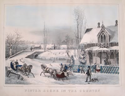
In the last blog, I talked about the wonderful print illustrated above by Joseph Hoover, a Philadelphia printmaker. Today I'll talk a bit about this publisher whose firm lasted into the early 20th century.

    Joseph Hoover started by making elaborate wood frames in Philadelphia in 1856, but within a decade or so he began to produce popular prints. Initially he mostly worked for other publishers, including Duval & Hunter, and he worked with noted Philadelphia artist James F. Queen. He also issued a few hand-colored, popular prints of considerable charm (like the one illustrated above). Later he produced decorative prints in black & white and then began to work in chromolithography, winning a medal for excellence during the Centennial for his chromolithographs after Queen’s renderings.

    joseph hoover and sons print chromolithographyThis was just the beginning of Hoovers work in chromolithography and he became one of the few native Americans who achieved success with this process. By 1885, Hoover installed a complete printing plant for chromolithography. By the end of the century, his firm was one of the largest print publishers in the county, with an average annual production of between 600,000 to 700,000 pictures.

    philadelphia hoover and sonsUsing chromolithography, Hoover was able to produce attractive, colorful prints that were still affordable for anyone to use as decoration for home and office. The audience for Hoover's prints was quite wide, extending through out the United States, and abroad to Canada, Mexico, England and Germany. The subjects issued by the firm are extensive, including genre scenes, still life images, views of American locations, and generic landscapes, including a series of charming winter scenes.

    For more chromolithography, feel free to visit PPS-West.com.

    Tuesday, December 8, 2009

    Winter Scene in the Country

    When one thinks of a Victorian holiday scene, and certainly that is the paradigm image many of us have, it is usually the great Currier & Ives winter prints that come to mind. With their cheerful winter scenes with snug homes, horse drawn sleighs and children playing, these iconographic images bring a smile to our faces, warm our hearts, and allow us to "remember" the "good old days of yore."

    Currier & Ives were, however, only one of the popular print publishers in the nineteenth century producing charming winter scenes. One of their competitors, from my city of Philadelphia, was Joseph Hoover, whose business went on to achieve considerable success late in the century with their colorful chromolithographs (cf. forthcoming blog). At the beginning of his career, however, Hoover produced hand colored lithographs in the same ilk as those by his more famous competitors from New York City.

    One of my favorite prints that brings with it all the wonderful feelings of the holiday is Hoover's print "Winter Scene in the Country" from 1868. Hoover did not have the same quality of artists as those who worked for Currier & Ives (such as George Durrie and Fanny Palmer), so his prints tend to be a bit more primitively drawn. This, in my mind, actually gives them a folksy charm, and certainly this print has all the elements we want in a holiday scene.

    A wonderful ginger-bread Victorian house is set into a winter landscape near a pond upon which children and couples skate. Other children frolic and sled on the hill in the background, while boys and girls from the house in the foreground rush off to join their friends. Two horse-drawn sleighs are passing by and a huntsman and his dog return from a successful hunt.

    While the drawing is not as fine as those on most Currier & Ives winter scenes, the quality of the lithography is first-rate. This is because this print was made by P.S. Duval and Son, one of the best lithographic firms in the country. Peter S. Duval was one of the first trained lithographers in the America, being brought over to Philadelphia from France in 1831 by Cephas G. Childs, a Philadelphia printmaker interested in expanding into the then relatively new print medium of lithography. Duval took over the Childs firm in 1834, bringing his son Stephen in as a partner in 1857.

    Duval produced many of the finest American lithographs of the nineteenth century, including many of the wonderful Indian portraits from the McKenney & Hall History of the Indian Tribes of North America as well as beautiful views like the scene of Philadelphia above. The delicate line and subtle color of the Hoover "Winter Scene" make it a very nice, though unusual, example of his work.

    Currier & Ives are famous not only because they produced some of the finest popular images of the nineteenth century, but also because their output, both in terms of different images and number of impressions of each, was so huge. Great Currier & Ives prints, though expensive, do come on the market with some regularity. Joseph Hoover, in contrast, was not nearly as successful and early prints by his firm are quite rare. Despite this scarcity, they sell for considerably less than similar images by Currier & Ives, so not only are these wonderful examples of Victorian popular art, they are also relatively affordable if you can find them.

    Thursday, December 3, 2009

    America Guided by Wisdom

    The actions of the United States government have a huge impact not just on its own citizens, but of all people. The decisions facing the President, in particular, are difficult yet of crucial importance for the entire world. We can hope the government is guided by wisdom and this is a hope that citizens have had since the founding of the country. Today many are sceptical or pessimistic on this score, but in the early days of the republic there was more belief and optimism. This positive attitude is nicely expressed in a wonderful allegory "America Guided by Wisdom," based on a design by John Janes Barralet.

    John J. Barralet (ca. 1747-1815) was an Irish artist who came to Philadelphia about 1795. He had established a reputation as a landscape and historical artist in Dublin and London. When Barralet first arrived in Philadelphia he was hired as an engraver by Alexander Lawson and soon took up painting landscapes in and around Philadelphia. Among American engravers, Barralet is credited with inventing a ruling machine for work on bank notes. Barralet is the artist of this print and the engraving was done by Benjamin Tanner, one of the leading Philadelphia engravers of the early Federal period.

    The print was issued just after the War of 1812, which was often called the “Second War of Independence” at the time. Following a series of naval victories and battles at Baltimore and New Orleans, Americans were infused with a new optimism based on a peace treaty that arranged for them to be left alone to develop their new country. This print uses symbols of republican virtues to express pride in the new country, paying tribute to the nation's growing industry and trade.


    In the eighteenth and early nineteenth century, educated viewers understood far more than we do about classical iconography, able to read and understand allegories such as this. However, the publisher felt descriptive text was needed and it helps provide us with information on the print. This text explains that the focus of the image is Minerva, Goddess of Wisdom, who points to an escutcheon of the United States with the motto “Union and Independence,” emblazoned on a shield held by female figure with a feathered headdress, representing America. As the description says, it is by "Union and Independence" that "the country enjoys the prosperity signaled by the horn of plenty, at the feet of America." Just besides America is a spear and shield with the visage of Medusa.

    To the right of this vignette is an equestrian statue of Washington at the entrance of a "Triumphal Arch." I am not sure how this works, but according to the descripion, this is "indicating the progress of the liberal arts." On the base of the statue is a plaque with Washington's birth and death dates, as well as the year he was inaugurated President.


    To the left of Minerva and America is a tableau that is best explained by the printed descriptive text:
    Commerce is represented by the figure of Mercury, with one foot resting on bales of American manufactures, pointing out the advantages of encouraging and protecting Navigation...to Ceres....
    Ceres is the goddess of agriculture and she is surrounded by symbols of America's rich agricultural prosperity, including a plow and wheat sheaves and a barrel and bundles of other goods.

    The navigation Mercury points to is represented by a number of ships, including an armed U.S. Naval vessel.

    Finally, again as explained in the descriptive text,
    The Bee Hive is emblematic of industry; and the femlae spinning at the cottage door, shews the first and most useful of domestic manufactures.