Showing posts with label Impact of prints on history. Show all posts

Monday, June 15, 2020

Lowering the curtain on the Currier & Ives Darktown Prints

I own a business which sells images of the past. Many of them are decorative or interesting in their own right, but to me one of the most important things about the old prints we sell is that they are historic artifacts. That is, they are evidence from our past, bringing their stories to the present. They tell us not only about the things they show, but also about what was of interest to the public at the time—-or at least what their publishers thought would be of interest—-and they tell us how the public at the time saw its world.


Past public attitudes are not always ones we agree with, nor even condone, but I have long argued that it is a mistake to ignore or trash historic artifacts that reflect beliefs we do not agree with. As George Santayana wrote, “Those who cannot remember the past are condemned to repeat it.” That is, it is crucial for us to learn about our past so that we can try to correct where we have gone wrong. For that reason, even abhorrent historic artifacts should be preserved and studied.


Our modus operandi has always been, that even if I did not agree with what a particular print depicted, we would offer it for sale so that someone interested in it—-hopefully for historic reasons—-could have access to it. On that basis, though I abhor the social implications of the Currier & Ives Darktown prints, I have felt it appropriate to have my shop offer them for sale. I no longer feel that to be the case.


So, what are the Currier & Ives Darktown prints? They are a series of prints which America’s most successful popular printmaker made from the late 1870s into the 1890s, showing supposedly humorous episodes in Darktown, a segregated community of black Americans. Darktown prints showcased a full array of negative stereotypes of the former slaves who moved north after the Civil War. Portrayed as mentally slow, physically grotesque, and morally oblivious, African Americans were shown as comically inept in their attempts to “play-act” at being white.


Horrifyingly, these prints were among the most popular of all Currier & Ives prints, with one image supposedly selling as many as 73,000 copies. Why that was so and what it means are things worth trying to understand, and there have been institutions and scholars who have approached the Darktown series in this way. I think that is important for our understanding of our past and also of our present to look at these issues.


This then raises the question of why I have decided we would no longer sell the Darktown prints. Certainly, to simply sell such a print is not to advocate for its racist message; we have sold them for many years despite the fact that I think what they show is terrible. As it happens, almost all of the Darktown prints we have sold have been to academic institutions or to African American collectors. Still, I now believe we should not be selling them at all.


The current national reexamination of our society’s racial inequities has made me rethink how we should treat these prints. I have come to believe that even if one does not present them as something one believes, racist images like these should not be presented to the public, except in a clearly restricted historic/educational venue. To have images like these out in public-—on display in a shop, at a show or on the internet—-creates a social environment which is detrimental to universal racial equality.


The point is that it is not what you mean by selling the prints, it is what they show and how that adds to the negative experience that African Americans have in our society. This is very similar to the issue of the display of Confederate statues in the South, and as I believe those statues should be taken out of public spaces, so too I believe the Darktown prints should be removed from public display. Every image that is out in public showing how in the past Blacks were thought of as inferior adds to the background noise insidiously whispering that they are not equal today. Their display, even if not meant this way, reminds both Blacks and Whites that in the not too distant past it was the social norm that the latter considered themselves to be superior to the former. This, in effect, becomes part of the systemic message of racial inequality that still permeates our country.


We need to effect many changes to bring about true racial equality in our country, both as a society and as individuals, and I think no longer selling or displaying the Darktown prints is something we can do to help, albeit in a small way. On that basis, we are donating all of our current inventory of Darktown prints to scholarly institutions, taking the images out of the general public environment and relegating them to the vaults of historic institutions. This is surely just a small step toward racial equality, but hopefully it is one of many such small steps our society will now be making.


Friday, May 11, 2018

A Cartographic War

On May 15, 1756, Britain declared war on France, opening the Seven Years War, the American part of which was called the French & Indian War. Though that was the official start of the French & Indian War, fighting had actually been going on for almost two years before that between the French and British in America. Beginning even earlier, however, was a cartographic war which was very much a prelude to the “hot” war that followed.

By the late seventeenth century, the French colonies in America consisted of two main parts. New France, or Canada, bordering the St. Lawrence River and the Great Lakes, and La Louisiane, considered by France to include the entire Mississippi River basin. The British lands in America at that time consisted of a series of colonies along the Atlantic coast, with a number of the original charters stating that they ran “from sea to sea,” though in practical terms they were limited to lands east of the Appalachian Mountains.

It wasn’t long before the British colonies began to look to expand. Their population was growing rapidly; for instance, it grew from about 250,000 in 1700 to over 1 million by 1750. The French were naturally concerned about British expansion. They had a relatively small population (only about 50,000 Europeans in 1750), and they saw British expansion as creating competition to their fur trapping and Indian trade.

This led to a series of Wars: King Williams War (1689-97), Queen Anne’s War (1702-1713), and King George’s War (1744-1748). Despite all this fighting, the treaties which ended those wars did not resolve the problems between the French & British in North America.

The Treaty of Utrecht ended Queen Anne’s War in 1713. By its terms, the French ceded to the British the lands around Hudson’s Bay, the island of Newfoundland, and Acadia, which the British called Nova Scotia. The problem with the treaty, though, was that the exact definitions of the regions mentioned were ambiguous, with a boundary commission supposed to adjudicate the exact borders. The commission didn’t meet until 1720, and then never really got anywhere.

The Treaty of Aix-la-Chapelle ended King George’s War in 1748. By that treaty, North America was supposed to return to the situation ante bellum. However, what that situation was, was no clearer then than it had been at the end of the previous war.


Naturally, French and British mapmakers tended to reflect their nation’s outlook on the issues related to North America, and this led to what has been called a “cartographic war.” This notion is well known among map dealers and collectors, the idea being that the maps for each side made claims promoting their colonies while diminishing the other country’s colonies. The idea is that each side was ‘flying the flag’; reflecting national pride. However, the cartographic war was much more than this and the story is worth examining closely.
Maps were one of the few ways European powers could establish their claims to territory. In the wilderness of North America, with relatively few settlements at the edges of the territories, the location of a border was often not marked in any way in the physical world. A line drawn on the map might be the only physical manifestation of a border. Sometimes, maps created the territories more so than any action on the ground.

Borders depicted on maps could have a reality beyond simply a line drawn on paper. Printed maps have an aura of legitimacy. If a feature is “on the map” the tendency is usually to accept it as real. If a particular border line was not questioned, then this could be taken as de facto evidence of its acceptance. Also, treaties often referred back to previous political situations, and what was shown on maps was sometimes the only way that this could be determined.

Besides their reifying power concerning borders, maps also had a considerable influence on public opinion. For instance, they could stir up the public if citizens thought another country was taking away their land, stiffening their resolve to resist any diminishing of the territory as shown on a map. The public’s attitude could in turn influence the government, so maps did sometimes have an effect on government decisions.

For all these reasons, the cartographic war which raged in the first part of the eighteenth century is best seen as a non-military, but still significant part of the conflict between France and Great Britain.


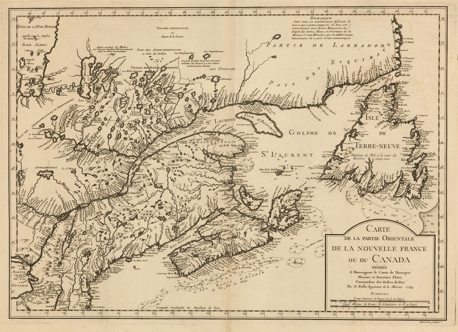
The first map in the cartographic war was this one by British cartographer Herman Moll. It was issued just two years after the Treaty of Utrecht as a statement of the British view of her colonies as determined by that treaty.

In the north it shows the British colonies as extending all the way north to the St. Lawrence River and up to the Great Lakes as far as Lake Erie. The colony of Carolina, which has its own inset, is shown extending south to just a bit above St. Augustine.

This British volley was answered just three years later by French cartographer, Guillaume Delisle.

Delisle moved the British border well south and east of the Great Lakes and the St. Lawrence River. He also claimed that Carolina was named after Charles IX of France and settled originally by the French, in effect claiming that region for France as well.
This map provoked considerable consternation in Great Britain. Because Delisle was the Premier Géographe du Roi, that is geographer to the King, his maps were regarded as semi-official, reflecting the views of the French government.


The publication of Delisle’s map provoked Herman Moll to issue a new map of North America to highlight the “Incroachments” shown on Delisle’s map, as a warning to the British of what the French were doing. A note on the map explained that
“All within the Blew Colour of this map, shews what is Claim’d by France...According to a French Map published at Paris with the French King’s Privelege. The Yellow Colour what they allow ye English.” Moll concluded that “any body may see how much they [that is the French] would Incroach &c.”


The New York officials were particularly upset about the French cartographic claims, as much of the land they considered to fall within their jurisdiction was usurped in Delisle’s map. Governor William Burnet wrote to the Board of Trade that “I observe in the last Mapp published at Paris with Privilege du Roy par M. de Lisle in 1718...that they are making encroachments on the King[‘s] territories...”
Many of the British claims around the Great Lakes were based on their long standing relationship with the Iroquois, especially concerning the treaties which they believed gave them the rights to the Iroquois lands. This British position was reinforced by a clause in the Treaty of Utrecht which stated that the Iroquois were British subjects. In 1724, Cadwallader Colden, the Lieutenant Governor of the colony, issued the map above to show how the region around the Great Lakes belonged to New York through their treaties with the Five Nations.

The British government felt the need for better maps, so it ordered the Lords Commissioners of Trade and Plantations, more commonly called the Board of Trade, to send a circular letter on this point to the Governors of the various colonies. The Board was the primary policy-making and administrative agency for the British colonies and in 1719 it sent the following instructions:
“It being necessary for H.M. Service and for the benefit of the Plantations, that the limits or boundaries of the British Colonies on the Continent of America, should be distinctly known and marked out, more particularly so far as they may border on the settlements made by the French or any Foreign Nations, we desire you to send us, as soon as possibly can, the best informations [sic] you can get upon your Government, together with a chart or map, and the best accounts and vouchers you can obtain to support the same....”


David Rumsey Map Collection

This resulted in a number of new maps being sent to the Board from the colonies. As the maps arrived in London, an assistant clerk to the Board, Henry Popple, compiled a general map of the “British Empire in America” with the Board’s “approbation.” As he stated on the map
“great care has been taken by comparing all the maps, charts, and observations that could be found, especially the authentick records and actual surveys transmitted to their Lordships by ye governors of the British Plantations and others to correct ye many errors committed in former maps.”

Issued in 1733, Popple’s production was a huge and detailed map which represented the best British mapping of the continent to date. The Board of Trade initially seemed impressed, writing to the Lords of Treasury that
“Mr. Henry Popple having with great care and Diligence drawn a Map of the British Empire in America, which, from the assistance he has had, from the best Charts and actual Surveys, is rendered infinitely more complete than any other now extant.”

Not only was the map detailed and based on the “best Charts and actual Surveys,” but it exhibited an expanded view of British holdings in America compared to Delisle and Moll. Nova Scotia is depicted as extending north all the way to the St. Lawrence River, and New York and Pennsylvania are shown reaching to the Great Lakes, while North and South Carolina are clearly depicted as British colonies.

However, British critics soon appeared. Popple was criticized for relying too much on French maps for his sources and for not taking a strong enough position relative to the extent of the British colonies. For instance, though New York and Pennsylvania reach the Great Lakes, Fort Niagara, on the eastern side of the Niagara River, is shown as part of French Canada. In 1738, Cadwallader Colden, clearly referring to the Popple map, wrote that “The English maps are such servile copies of the French that they mark out the boundaries between the English and French with the same disadvantage to the English as the French do.”


In the 1720s and 30s, the main area of conflict between the French and British in North America concerned the region north of New England and south of the St. Lawrence River. By the Treaty of Utrecht, in 1713, the French had ceded “all of Nova Scotia or Acadia, in its entirety, conformable to its ancient borders.” The British understood “Nova Scotia” as encompassing the entire region up to the St. Lawrence, today’s New Brunswick and Nova Scotia, whereas the French understood it as applying only to the Nova Scotia peninsula.
In 1740, political tensions in Europe led to the War of Austrian Succession, between Austria and France allied with Prussia. Great Britain was drawn into the war as an ally of Austria, declaring war on France in 1744. The war between France and Britain almost immediately led to armed conflict in the northern parts of America, what is called King George’s War. Various raids and battles occurred, with the only major event being the British capture of the fortified French port of Louisbourg. This war ended with the Treaty of Aix-la-Chapelle in 1747, which essentially restored the situation in North America ante bellum, a situation which, as I have said, was ambiguous and contentious.

Like with the Treaty of Utrecht, the new agreement called for an Anglo-French commission to meet and determine the borders of the regions referred to in the treaty. Beginning in 1750, commissioners met in Paris to negotiate on these matters. By that time, two main areas of conflict had developed. One was the old issue of what meant by “all of Nova Scotia or Acadia according to its ancient borders.” The other concerned the Ohio River Valley.

The French well knew that the British colonies were wealthier and more populous than their own, and they were afraid that the British would expand westward into the regions they depended on for their fur trapping and Indian trading. In 1749, Pierre-Joseph Céloron de Blainville led a French expedition down the Ohio River, leaving engraved plates along the way expressing French claims for the Ohio River.

Meanwhile, the British were starting to focus on their own claims to the lands west of the Appalachian Mountains, based on the original charters. A number of groups were formed to pursue British settlement and development across of the mountains, and these were granted large tracts of land by British colonial governments. Obviously, French and British interests conflicted in the Ohio River Valley.


Library of Congress

This map by British map publisher Robert Sayer shows, from the British perspective, “The Limits of His Majestys several Provinces...here laid as they at present exercise their Jurisdictions.”

The British colonies are shown encompassing all the lands south of the St. Lawrence, and extending all the way to the Mississippi. To make sure the point was clear, Sayer added a note that said:
“The French have streched [sic] their Louisiana on both sides the Mississipi [sic], which is another instance of their Incroachment, for they have no just claim to any part of the Country lying Eastward of that River.”

The French and British border commissioners, trying to determine what were the “ancient borders” referred to in the treaty, naturally looked at maps published previously as part of the negotiations. However, they could find no consistency nor clear answer, as the maps, both those made by the French and by the British, were unclear and showed contradictory information.


Library of Congress

The Acadian boundary dispute was the most important part of the negotiations for both the French and the British commissioners, for it was seen as the key to the sea routes to and from North America and the economic wealth from the nearby fisheries. Thus French and British mapmakers paid special attention to the details in the mapping of the region. One of the leading French mapmakers, Didier Robert du Vaugondy issued a map of Canada in 1753 which made no mention at all of “Nova Scotia” and showed Acadia as referring to a just a small strip along the bottom edge of the peninsula.
This map caused quite a stir in Great Britain, for not only was Vaugondy’s map dedicated to the French secretary of state, but he advertised that his map was based on reports communicated to him from the Ministry of War, implying it represented official French policy. As what the designation “Acadia” referred was just the point then being negotiated by the Boundary Commissioners, Vaugondy had to provide a retraction stating that his map did not reflect an official government position.


Library of Congress

Vaugondy’s map, naturally, provoked a British response with this map by Bradock Mead, which shows Nova Scotia as extending from the peninsula all the way to the St. Lawrence River. Mead was very clear in his attitude to the French maps that claimed otherwise, writing in a 1754 pamphlet, “[France’s] geographers and historians have been influenced to prostitute their pens in the most shameful manner, to serve the injurious cause.”
Interestingly, the Popple map, which had been made specifically to support the British position in North America, actually caused the British negotiators problems two decades later with their claims to the Ohio River Valley. The French commissioners pointed out that Popple did not show the British colonies extending beyond the Appalachians, and that since Popple stated on the map that he “undertook this Map with ye approbation” of the Board of Trade, this implied that it reflected the official British position at the time.

The British had to reply that while the Board “might very well [have approved] of such an Undertaking,” Popple’s map was “framed according to his own particular Notions; he published it upon his own single Authority; the Board of Trade at the Time gave it no extraordinary Sanction... it has ever been thought in Great Britain to be a very incorrect Map, and has never in any Negociation between the two Crowns been appealed to by Great Britain as being correct, or a Map of any Authority.”

In any case, the Boundary Commission negotiations continued through 1753, but no progress was made and soon the commissioners were recalled. Negotiations didn’t stop, however, but changed their nature. The Boundary Commissioners had been tasked with determining what was meant by the terms of the existing treaties, but now there was direct negotiations between British and French officials to work on a new geopolitical agreement with newly determined borders. The discussions continued to focus on the Acadia question and the trans-Appalachian region, with various proposals being put forth, including the possibility of having a neutral ground in between the French and British colonies, with rights to free access by traders of both nations.

The Boundary Commissioners had used old maps to try to determine existing borders, but in the new negotiations, the British officials wanted accurate maps upon which to establish new boundaries. The problem was that with the discrediting of Popple’s map, they did not have any really good British-made maps of North America. Consequently, in 1749, the Earl of Halifax, the president of the Board of Trade, commissioned a prominent Virginia-born physician, John Mitchell, to compile a map of North America using the Board of Trade’s archives. Mitchell produced a manuscript draft in 1750, but this was seen to be inadequate. Thus the Board sent out another directive to the governors of the American colonies for them to have better maps made and sent to London. As the new maps came in to the Board from the colonies, Mitchell was given access to them.


Newberry Library

The result was that in February 1755, Mitchell’s huge “Map of the British and French Dominions in North America” was published. Mitchell not only used the latest information, but he based the political borders on the original Royal charters and patents, showing the colonies as extending well beyond the Appalachians, and indeed beyond the Mississippi to the edge of the map. In the northeast he showed British lands as not only reaching up to St. Lawrence River and the Great Lakes, but also to lands north of Lakes Ontario and Erie.
It is interesting to note that the Earl of Hardwicke, the British Lord Chancellor, who was in charge of the negotiations then going on with the French, was very concerned about the publication of the map. He wrote:
“I fear very inconvenient Consequences from it, for it carries the Limits of the British Colonies as far, or farther than any other, which I have seen. If it should out just at this juncture with...the Sanction of the Board of Trade, it may fill people’s heads with so strong an opinion of our strict Rights, as may tend to obstruct an Accommodation, if attainable, ...& make what may be necessary to be done to avoid the fatal Evil of a War, the Subject of great Clamour.”

This is actually just what the Board of Trade intended. The Earl of Halifax, the President of the Board, was a hawk in terms of British rights in North America and he specifically wanted the Mitchell map to be released so as to pressure His Majesty’s Government not to concede too much to the French.
That the Mitchell map had an impact on the British public is clear, for reduced versions of the map were published in at least four different British “gentleman’s magazines” within the year.
Illustrated monthly magazines first appeared in London in 1731. These magazines, with such names as Gentleman’s Magazine and London Magazine, contained poetry, prose, and articles on events, fashions, personalities, and other items of the day that might be of interest to the British gentleman. Illustrated by wood and copper engravings, the magazines included many maps, often related to current events.

Naturally, the tensions with the French generated a good number of maps, some appearing as early as the 1740s but then a large number by 1755, when at least 18 magazine maps related to the conflict in North America were issued.

These maps not only informed readers on the events taking place over the oceans, but they also helped to sway public opinion. The many copies of Mitchell’s map in the British magazines, and of course the extraordinary original eight-sheet Mitchell map itself, had a considerable effect on the British public, stiffening their attitude towards any sort of compromise with the French. Not surprisingly, the British government began to take a harder line and very soon the negotiations with the French were broken off.


Click here to see maps of the French & Indian War

While these negotiations had been going on—-to no avail-—events in North America were progressing on their own towards war. Fighting in western Pennsylvania, combined with increased public fervor concerning the French “Incroachments,” as well as concerns elsewhere in the British empire, led to the inevitable declaration of war on May 15, 1756.


Friday, September 22, 2017

Musings on Selling Confederate Prints

We have recently acquired a couple of important historical prints with a Confederate theme: a portrait of Robert E. Lee and an image of a Confederate encampment. Both of these are rare, significant images, the type of prints I have always been proud to handle. However, the recent controversy related to the statues of Confederate “heroes” has given me pause to consider just how pleased I should be to be selling such prints.


Personally, I believe that the statues of Confederate figures should be removed from general public display, where they are presented as glorifications of a cause essentially based on the preservation of slavery, and put into places where they would be presented instead as historic artifacts to be understood as part of our history. That is, where they will be objects which we can learn from rather than glory in.
So, how does this belief relate to my shop selling Confederate prints to the general public? After considerable thought, I believe that it is fine to sell the images, even though they do, in their own way, present aspects or individuals of the Confederacy in a positive light.

To decide this, I looked at what I consider to be the main arguments for removing the Confederate statues from prominent public display.

  • The Confederacy was based on the belief of white supremacy, with the aim of maintaining slavery, and this should not be honored by our society or members of our society.
  • The statues are sanitized symbols of a horrible part of our nation’s history and to place them in an honored, public space ignores the evil which the Confederacy embodied.
  • While the Confederacy is a part of our nation’s history and we should not try to “erase history,” the statues are a glorification of this loathsome part of that history, not simply a recognition of its existence.
  • In almost all cases, the statues were created and erected specifically to venerate the Confederacy and to promote its concept of white supremacy. The majority were built not just after the Civil War—when most monuments related to the war were memorials to individuals—but between the 1890s and the 1950s, erected specifically in response to Reconstruction and the Civil Rights movement.

So, how do these arguments apply or not apply to prints of the Confederacy? There are many prints which present a negative view of the Confederacy, and these are not at issue. The prints which are at issue are those which present aspects or figures of the Confederacy in a positive light.

Most of these prints have their genesis in the notion of “The Lost Cause of the Confederacy.” This was a conception, which appeared soon after the war, based on a wishful reimagining of the history of the Civil War in order to vindicate the actions of the Confederacy and restore some sense of pride to Southerners. The “Lost Cause” model presented the Confederate cause as a heroic one, where overwhelming odds led to the defeat of a noble South. The war was presented as a struggle to maintain the Southern way of life, which was more Christian and civilized than the greedy Northern life-style.

Part of the “Lost Cause” idea was a denial of the significance and horror of slavery. Slavery was not supposed to be central to the Confederate cause, and it was often presented as a relatively benign institution. The prints issued as part of the “Lost Cause” idea were published not as a reaction against civil rights and equality of the races, but rather an avoidance of those issues totally in an attempt to reestablish a sense of pride in a culture which had suffered abject defeat.


A great example of the “Lost Cause” concept is William D Washington’s image of the “Burial of Latane.” This painting, and the print based on it, show the burial of Captain William Latane, who was killed while on a raid with J.E.B. Stuart’s cavalry. In the image of Latane’s burial there is a stark absence of any men; the burial party is composed solely of women, children and “faithful” slaves, celebrating both the devotion of Southern women and their bond with the slaves. This print was issued in 1868 and would have hung in many Southern homes, allowing the population there to retain some sense of pride in their history and culture.

The print of the Confederate encampment by Conrad Wise Chapman had a similar role. Chapman, a sergeant in the Confederate army, made many sketches of his experiences in the war, including one upon which this print was based. It clearly expresses aspects of the “Lost Cause” concept, with the proud Southern soldiers going around with bare feet, while several blacks are shown happily at leisure, even while the soldiers cook or otherwise work, a highly unlikely state of affairs.
One can look at these prints not as glorifications of slavery and white supremacy, as are the statues, but rather as unfortunate attempts at Southern self-respect. The claim has been made that this is the case also for the statues, but that just is not true. A look at the history of their erection makes it clear that the original intent of the statues was to glorify the Confederacy and promote its defense of white supremacy.


However, I do not think that the original intent is the essential difference between the statues and the prints. That, I think, lies instead in the way the present impact of the prints, compared to the present impact of the statues. I do not think that all, or even most, of the citizens in the communities where the statues now stand would endorse white supremacy, but given their history and their prominent locations, where they loom over public spaces, these statues silently yet expressively make a statement that can and is read by members of those communities as an endorsement of that abhorrent position.
The prints, in contrast, are almost exclusively used in a private or an academic setting, where the reasons for their display can be understood benignly, and where there is no similar deleterious public impact like that of the statues. Now I am sure that there were instances where Confederate images were put on display in a court house or other public location, where they were intended to have an impact similar to the statues. If such a situation exists today, for instance with a portrait of a proud General Lee hanging in a court house, I think that is a situation which does mirror that of the statutes and the portrait should be removed.

However, most of the uses of Confederate prints are in private homes, collections, or in museums and libraries, where they do not have a general public impact. If a Confederate statue is placed in a similar setting, for instance if someone has a statue of Lee in a private home, perhaps because an ancestor fought under the general, I would argue that there is nothing wrong with that. Indeed, I think having the statues on display in a historic setting, say in a museum, is important, for it would be a mistake to ignore our history, and it is important to understand our past in all its complexity.

I would like to say that owning Confederate images is ok as long as one’s intent is “pure,” that is, as long as one is not intending to promote the odious aims of the Confederacy, but instead where one is treating the images as artifacts, part of the multifaceted fabric of our history. However, it is an impossible and probably incoherent to try to judge the intent of a buyer (though if I knew that a potential buyer was intending to use a print to promote white supremacy I would not sell it to that person).

In the end, however, I think the original and current use of prints is quite different than the original intent and current effect of the statutes, and I do think that they are important artifact of our past (the statues too are important artifacts of our past, just ones that should not hold places of public honor), so it is ok for our shop to be selling them.


Tuesday, April 28, 2015

THE SEARCH FOR EL DORADO

Of all the legends relating to America, perhaps the most recognizable myth concerns “the search for El Dorado.” While this phrase is very familiar, the actual story behind the hunt of El Dorado is not. This myth is one of my particular favorites, for it has all the elements of a great story—-mystery, riches, adventures, madness, deaths--and to my delight, maps.


The myth of El Dorado started in the early sixteenth century as the search for “El Hombre Dorado,” that is, the golden man. By 1540, the Spanish in America very much had gold on their minds, and no wonder. In Cuba they had heard tales of a rich kingdom on the mainland of North America, and when Hernán Cortés went there in 1519, he discovered and conquered the immensely rich Aztec Kingdom. Just a few years later, the Spanish in the newly subjugated territory heard of another rich kingdom to south, and Francisco Pizarro soon discovered and conquered the also immensely wealthy kingdom of the Incas. After those two tales of rich kingdoms proved so fruitful, who among the Spanish would be lax in following up any subsequent rumors? Such a story soon appeared, that of El Hombre Dorado, and this led to one of the most horrific, bizarre and unending searches for riches in the history of the Americas.


The story of the golden man began in the Columbian highlands, fairly near present-day Bogota. There are a number of explanations of the true basis for this legend, but they all concern the Muisca Indians of the central Colombian plateau in the area of Lake Guatavita. There seems to have been some sort of religious ceremony concerning a Muisca chief, the lake and gold. One story had this chief coating his body with gold dust and then bathing in the lake, an event shown by Theodor De Bry (engraving illustrated above) and also supposedly depicted in the famous gold Muisca Raft. There does seem to have been some sort of ceremony involving the Muisca and gold, but whatever its factual basis, when the story of a golden man reached the Spanish about 1541, it set off a long series of searches for El Hombre Dorado.


A number of Spanish conquistadors set off in 1541 and did make it up to the area of Lake Guatavita, even attempting to drain the lake to find any gold under its waters. Using their typical methods of persuasion—-including torture—-the Spanish tried to get the Muisca to show them the gold. There was some gold in the area, but not nearly enough to convince the Spanish that they had found the true El Hombre Dorado. Finally the Muisca realized that the only way to get rid of the gold-crazed Spanish was to send them away by telling them, in effect, “Oh, that El Hombre Dorado. Yes, we know where he is, over the mountains that way....”


For the next half century, the search for El Hombre Dorado worked its way slowly across the northern part of South America, from the Colombian highlands, down into the Amazonian basin, working ever eastward. Time and again, the Spanish would arrive in an area that they had been told was the location of El Hombre Dorado, only to find none of the riches they sought even after “questioning” the locals, and then to be told, “Oh, that El Hombre Dorado. He resides over that way...”


A number of major expeditions went in search of this myth, including Gonzalo Pizarro and Francisco de Orellana in 1541 and Lope de Aquirre in 1560, wasting much effort, expenses, and hundreds of lives, both natives and Spanish. The huge effort and costs expended on the search and the horrors experienced made this legend one of the most powerful of American history. A nice depiction of the madness which consumed the Spanish is Werner Herzog’ movie, “Aquirre, the Wrath of God.”


At some point, the story began to morph in its content as well as location, for the search began to focus on a rich kingdom or city, rather than a man, the legend becoming that of simply “El Dorado.” One man who accepted as true this form of the legend was Antonio de Berrio, who believed the city lay in the Guiana Highlands. Berrio started to search there in 1584 and he heard from the Indians that there was a large lake south of the Orinoco River that was so large it took them three days to paddle across it, and upon the shores of which lay a rich city, that is, of course, El Dorado. He tried several times to find the city, eventually becoming convinced it lay up the Caroni River, a branch of the Orinoco. Berrio was unable to ascend the river, but his delusion was fully confirmed when he met a man named Juan Martinez (aka Juan Martin de Albujar).


Martinez had been on a ship sailing on the Caroni River when its gunpowder exploded. Martinez, blamed for the accident, was left behind as punishment. He eventually made it back to Spanish settlements, claiming that he had been rescued by friendly Indians who took him to a city called Manoa, where the palace was made of gold. He further claimed he was given great riches when he left, but that they were stolen from him on his return trip. Thus it was that El Hombre Dorado now became the city of Manoa, or El Dorado, located on a large lake in the interior of Guiana.


At this time another famous figure makes his appearance in our story, Sir Walter Ralegh. Ralegh set sail from England in 1595, in order to discover “a better Indies for her Majestie [that is Queen Elizabeth] then the King of Spain has any.” Ralegh captured Sa Jose on Trinidad in April 1595 and took Antonio de Berrio captive. Ralegh had heard rumors of El Dorado and was able to convince Berrio to tell him all he knew of this legendary city, a story which Ralegh bought into totally.


Ralegh wanted to convince the Queen to conquer Guiana so he published a report, The Discovery of a Large, Rich and Beautiful Empire of Guiana in 1596. This included a full description of Manoa/El Dorado, conflating many of the old stories about El Dorado. About the same time Ralegh produced a map of northern South America showing the large lake, now named as Lake Parime, and the city of Manoa.


After Queen Elizabeth died, her successor, James I, who immune to Ralegh’s charms, threw Sir Walter into the Tower of London. Ralegh petitioned James to get out so he could go find El Dorado and make the monarch rich. James was convinced enough to allow Ralegh out on this mission, but only on the condition that he not get into a fight with the Spanish. Ralegh set off for South America in 1617, and through a series of misfortunes, including battles with the Spanish resulting in the death of his son, returned to England a failure. James threw him back into prison and soon thereafter, at the urging of the King of Spain, Ralegh was beheaded; one of the last deaths directly related to the legend of El Dorado.


Though his search for the fabled golden city failed, Ralegh did manage to put El Dorado on the map. Based on Ralegh’s book, Joducus Hondius, Sr., Theodor De Bry, and Levinus Hulsius all issued maps by the end of the sixteenth century showing Lake Parime with Mano or El Dorado on its shores.


The lake and its golden city continued to appear in the seventeenth century, changing shape and with Manoa moving around a bit.


In the eighteenth century, the lake began to be called into question. Some of the more scientifically inclined (and skeptical) cartographers such as Vincenzo Maria Cornonelli and Guillaume Delisle either showed the lake with notes calling it into question, or didn’t show the lake, but included notes mentioning its possible existence.


By the end of the eighteenth century, Manoa was pretty much forgotten and “El Dorado” had simply become a phrase meaning hopeless quest. Manoa/El Dorado soon disappeared from most maps, though interestingly, Lake Parime, which was simply one more fictional element of the El Dorado myth, did not disappear along with the city. This was an excellent example of how once some location—-real or fictional—-appears “on the map” it tends to stay on the map.


In the early nineteenth century, the famous German explorer and scientist, Alexander von Humboldt, went looking for Manoa and Lake Parime, concluding that neither had any basis in fact. His prestige was such that this tended to remove Lake Parime from many maps, but the lake did continue to appear on others well into the century.


Click here to view on-line lecture on the cartographic myth of El Dorado.


Friday, March 13, 2015

Maps of Ireland and the Black Irish

The term “Black Irish” is usually used to describe Irish who have dark features, black hair and dark eyes (in contrast to the more “typical” stereotype of the fair skinned, blue eyed and blond or red headed Irish). The Black Irish are generally found in western Ireland. There are a number of explanations of the origin of the Black Irish, but my favorite has to do with maps!


In 1588, the Spanish Armada was beaten badly by the English and were driven out of the English Channel to the east. Fearing trying to run the gauntlet by returning through the Channel, the surviving ships of the Armada sailed north, around Scotland, planning to head west, then south back to Spain.


The ships turned south too soon, sailing very close to the Irish western coastline. This proved disastrous when gales blew in from the west and sent quite a number of ships to destruction on the Irish shore. Many men died by drowning or were killed by English troops, but some did survive. The story is that these Armada survivors married into the local population, thus propagating the Black Irish.


So why did the Spanish turn south too soon? One factor was simply the fact that it was at that time very difficult to know your exact longitude, and another was perhaps that they did not account as they should have for the Gulf Stream, which flows to the north-east. However, the story I like, is that they were using maps which didn’t show Connaught’s western bulge. The Mullett Peninsula in County Mayo extends quite a ways further west than the more northern coast and this was not shown on the earliest maps of Ireland.


For instance, Gerard Mercator’s map of Ireland (which is shown as printed at top of the blog and oriented to the North just above) shows the western coast as with very little western bulge and most other maps of the earliest period were like this. If you were navigating south along the western coast of Ireland in 1855, using a map such as this, you would not expect the Mullett Peninsula to jut out as you got past Donegal Bay. Perhaps this was what happened to the Armada ships?


In any case, by the end of the seventeenth century a more correct shape of the west coast of Ireland appeared and that mistake would no longer occur. Collectors usually like earlier maps in any case, but for maps of Ireland, it is maps such as Mercator’s that are particularly desirable. Even if not a true tale, it certainly makes a good story!

Thursday, October 18, 2012

Maps & the Kansas-Nebraska Act

I recently finished reading Susan Schulten’s fascinating Mapping the Nation. History and Cartography in Nineteenth-Century America. This scholarly work examines the development and importance of thematic maps in the United States during the 19th century. (The maps discussed in the books and an interesting blog by Susan can be found on the Mapping the Nation web site) One section that really caught my attention was the use of maps as part of the national argument over the Kansas-Nebraska Act of 1854 (pages 128-130).


In the previous blog, I discussed the Kansas-Nebraska Act as the most important change in the political borders of the trans-Mississippi West during the 1850s. It wasn’t just in political borders that this act had an impact, for it was one of the most controversial Congressional acts in an ante-bellum period filled with controversial acts.


The crux of the issue was, of course, slavery. In the Missouri Compromise of 1820, Congress laid down that slavery would not be permitted in the Louisiana Purchase lands north of 36°30” latitude. By the Kansas-Nebraska Act, however, these new territories would be created under the process of “popular sovereignty.” This allowed the citizens of Kansas and Nebraska—-despite the fact that both were north of the Missouri Compromise line—-to vote on whether to be free or slave.


To those opposed to the expansion of slavery, this was clearly a case of Congress stepping over the line drawn, not in the sand, but on the map. This caused a huge outcry in the north, led to the creation of the Republican party, and was one of the primary causes of the Civil War.


The issue was at its core a geographic one, so it is not surprising that maps played an important role in the furor over the Kansas-Nebraska Act. The act was introduced by Stephen Douglas on January 4, 1854, and within days a “large and influential meeting of citizens opposed to any violation of…the Missouri Compromise…” was held at the Broadway Tabernacle in New York City. Called “to protest against the project now pending in the Senate of the United States, for the repeal of that section of the Missouri Act which forever prohibits Slavery in the Territories lying north of 36 degrees and 30 minutes,” the meeting was attended by about 3,000 citizens.


Of great interest was a prop used for the meeting. As reported in a newspaper, “The front of the choir, in rear of the pulpit, was illuminated by a row of lights, intended to display the proportions of a large and handsome map of the United States and the Territories, prepared for the occasion by Mr. Colton. The map was painted upon white canvas and displayed the relative sizes and proportions of the States and Territories. A heavy black line was drawn entirely across its face, from the Atlantic to the Pacific, representing the latitude of 36°30’—-the line which defines the limitations imposed by the Missouri Act. The new Territory of Nebraska was indicated in its appropriate place, as proposed in the bill providing for its organization.” (The original bill mentioned only one new territory, Nebraska, but concerns about its vast size soon caused the bill to be modified to create two new territories).


This map was drawn by George W. Colton, whose father had a map publishing firm that was one of the country's most influential, and which George would take over with his brother in about a decade. Colton’s large, hand-drawn map graphically demonstrated that slavery would no longer be limited to the southern part of the country, for if slavery were voted in by the new territories, it would extend all the way to the northern border. This map helped galvanize the meeting and was referred to by many of the speakers.


A short time after the meeting, a New York abolitionist paper, The Independent, ran a woodblock cut map “drawn for us by our obliging friend Mr. George Colton.” This map is clearly a simplified version of Colton’s painted map used at the meeting. The paper said the intent was to “present our readers with a beautiful and accurate delineation of the States and Territories of our Union, illustrating their relation to slavery.” The white states were free-soil, the black slave, and “The Territories in regard to which the question of slavery or free-soil is yet an open one, are shaded as doubtful.”


This map was seen as an effective way to raise awareness of the threat of the expansion of slavery through the Kansas-Nebraska Act and The Independent was keen to spread the word. “We have preserved the engraved block; and can furnish stereotype casts like that which we now use, for two dollars each, to any paper that desires to aid diffusing through the community a correct idea of the extent of the monstrous iniquity that is now proposed.” An example is shown above from Concord's The Statesman’s April 1, 1854 issue.


The controversy over the Kansas-Nebraska Act was one of the main forces leading to the creation of the Republican Party and the Presidential candidacy of John Fremont in 1856. Other maps inspired by Colton’s original began to appear that year, for instance a map by John Jay 1856 in the New York Tribune, where Jay called on the readers to “Now look on the map, blackened by slavery.”


A whole series of other maps on the same theme were produced as part of the 1856 Presidential campaign. As discussed in Schulten’s book, William Reynolds issued his “Political Map of the United States,” where he differentiates the slave, free-soil, and territories “open to slavery or freedom” by the use of different colors. One thing Reynolds does as well is highlight the Missouri Compromise line with a bold white slash across the middle of the map.


Another 1856 broadside map, by G.W. Elliott, used a bold black line to show the Missouri Compromise demarcation and also distinguished the different status of the states and territories with reference to slavery, and other such maps were used during the campaign (a previously unknown version is discussed on Susan’s blog). Maps can convey some information in a graphic form which has a power beyond that of mere words and the use of maps related to this issue is a perfect example of that power. Despite the fact that Frémont lost, these different maps related to the Kansas-Nebraska Act played an important and fascinating role in American history between 1854 and 1856.


Monday, October 18, 2010

Representations of Economy at Library Company


I spent last Friday at a terrific print conference at the Library Company of Philadelphia. Entitled "Representations of Economy. Lithography in America from 1820 to 1860," this conference was sponsored in part by "Philadelphia on Stone," which I have discussed in an earlier blog. Philadelphia on Stone is a project under the auspices of the Visual Culture Program at the Library Company (VCP@LCP), which joined up with the Program in Early American Economy and Society (PEAES) to put on the conference.

A lot of confusing names of programs, I know, but this conference is a great example of the exciting results of new programs and collaborations which have been appearing at the Library Company and elsewhere. VCP@LCP is a program which promotes the study of historical images as primary source material (note that the images in this blog are all from the image data base they have put up on the Philadelphia on Stone web site). If you have read this blog regularly you will realize is a thing I am very keen on. As Cathy Matson, director of PEAES said, historic images are not just supplements to textural history, but they are primary sources which can provide unique information and insights.


PEAES is a project from LCP which is dedicated to the promoting of the study of early American economy, broadly understood. The two programs obviously overlap considerably and it was in that area of overlap that this conference was conceived.

The period between 1820 and 1860 was one of tremendous change in the American economy, with the country moving from a primarily agrarian/rural society to an industrial/urban one. In this period, lithography made its appearance and grew to be the dominant printmaking medium. Lithography was not only a product of the changing American economy but it also graphically reflected that metamorphosis. Even more, in a period when many were illiterate or did not speak or read English, pictures provided them with much of their understanding of their world. Thus, these historic images helped to both form and disseminate the culture of the period. Last week's conference examined these and more of the fascinating aspects of American lithography in this period.

As an introduction, we were treated to viewing a film posted on YouTube which explains and demonstrates the process of lithography. It is worth viewing for anyone interested in how lithographs are made and can be seen here.

All of the talks were stimulating. I learned a lot and ended the day with a load of questions I'd like to pursue, including:

  • How were the large "trade cards" (really advertising broadsides) of Philadelphia businesses used? We they posted in public spaces, sent out to resellers, put in shop windows, or used to adorn the boxes or packages the goods were sold or shipped in? No one really knows how they were used and there are few, if any, images showing them being used, so there are lots of possibilities to consider.
  • I'd love to learn more about on how popular prints were sold. Gigi Barnhill and Nancy Finlay both discussed the business of print selling by popular print makers, but there is much more to learn.


Without spending far more time than I can spend on this blog, I can only skim over some of the topics and questions generated by the conference. The conference was a great example of how current scholars are using historic prints to not only increase our knowledge of our past, but also to open up new avenues to explore.

In finishing I have to mention another conference which is coming up in just a couple weeks that I know will prove to be just as stimulating and educational as last week's.This is the annual conference of the Center for Historic American Visual Culture at the American Antiquarian Society.

Last year I was able to attend this conference (and wrote a blog about it), and I wish I could go again this year, for it is on a topic which I think is great fun: "History Prints. Fact and Fiction." The conference will take place in Worcester, MA, on November 12 and 13th and it will be well worth attending for anyone interested in historic prints. Registration is open until October 29th. More information can be found here.