I love history and I love maps, so naturally I love my job! Just handling the old maps, researching them and chatting with fellow cartophiles makes my career a wonderful one. However, I do get extra enjoyment when I find some fact or bit of information on a map which makes it even more fun than usual. I thought I would share three such stories which I have come across recently.
In February 1844, a fairly obscure magazine,
The United States Magazine and Democratic Review, issued a map entitled "The Indian Territory." This was issued as part of an article about the U.S. Government's policy of creating a territory west of the Mississippi where all the Native Americans, including those from the East, would be confined. This small map (which is oriented to the west) illustrates that territory, with the location of each tribe marked out, from the Sioux in the north to the Choctaws in the south.
Though the U.S. government claimed that this policy was for the benefit of the Indians, really it was to get the Native Americans out of any land which might be useful to "Americans" and place the Indians on land which was (at the time) considered to be essentially worthless.
When we got this map the other day, I was surprised and fascinated by the dashed line across the middle of the map labeled "Western habitable limit." What is interesting about that is that a fair bit of the land set aside for the Indian Tribes (including most of the land marked for the Pawnees) is west of that habitable line. This means that not only were the Indians given land that wasn't of use to "Americans," but much of it wasn't even considered habitable!
Looking closely at maps often reveals interesting tidbits. Such is the case on a map issued in the
Illustrated London Times on June 1st, 1861. This is just after the beginning of the Civil War, and this map features that event by indicating with its different tints those states which are slave and those which are free states.
1861 was also the year in which three official and one unofficial new U.S. territories were created: Nevada, Dakota, Colorado and Arizona. It appears that the cartographer, Theodor Ettling, received information on these new territories, as all three are depicted. Both Nevada and Dakota are shown properly, and Ettling also shows the territory of Arizona--carved out of the southern part of the Utah Territory, but never recognized by the U.S. government. Colorado is also depicted, but very incorrectly.
Ettling must have heard that a territory of Colorado was being created, but not the reason for this (i.e. Pikes Peak gold rush). He did know of the Rio Colorado located in Texas, so it appears he assumed that is where the new territory would be located. Thus he drew a border around a territory labeled “Colorado” in the southern part of Texas!
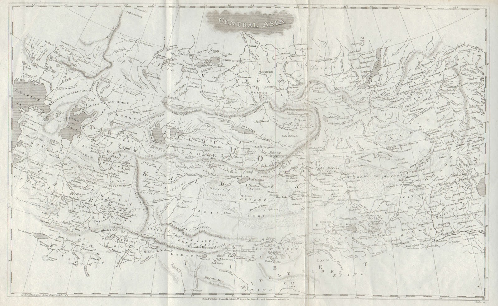
The final map which I'll write about today is a map of Central Asia which appeared in the 1804
A New and Elegant General Atlas jointly produced by Aaron Arrowsmith and Samuel Lewis. The American maps were on the whole drawn by Lewis, while the maps of the rest of the world were by Arrowsmith. Aaron Arrowsmith was at the time the leading cartographer in the world, very concerned to make his maps as up-to-date and accurate as possible. He compiled many maps himself, but also used the maps by other cartographers if they were the best source available to him. As a conscientious scientist, Arrowsmith would often note at the bottom of a map when he used someone else's mapping.
I had a good chuckle when I looked at the attribution on this map of Central America, for there Arrowsmith put “From Du Halde, D’Anville Islenieff &c.&c.
but Imperfect and inaccurate authorities." I guess even though Arrowsmith didn't think the source was very good, it was the best available to him. Still, I have never seen a map before where the mapmaker labeled it as "imperfect and inaccurate"!