Showing posts with label Print Processes. Show all posts

Tuesday, March 31, 2015

Meat Extract and Chromolithography

A rather unusual juxtaposition of subjects, but one which is delightfully represented in a set of six cards issued by the Liebig Meat Extract Company in the late nineteenth century.


Baron Justus von Liebig was a German chemist of considerable note, considered one of the founders of organic chemistry. Concerned about providing inexpensive nutrition for Europe’s poor, he invented a method for producing extract from cattle carcasses, supposedly preserving the flavors and nutrients of the beef. The cost for the process proved considerable, but a young Belgian, George Christian Giebert, came up with a feasible plan to produce the extract in Uruguay, where land and cattle were plentiful.


In 1865, Liebig and Giebert formed the Liebig Meat Extract Company, with its factory in Uruguay, and it went on to great success. Not only did the company make its meat extract a popular item for kitchens throughout the world, but it also introduced both Oxo meat extract and beef stock cubes, not to mention Marmite (which I think is pretty awful, but which my wife loves!).


In 1872, the company started to issue promotional trading cards on all sorts of subjects, usually issued in sets of six cards on one topic. They were produced initially in lithography, then chromolithography, and finally offset printing. These cards were hugely popular and supposedly by the time Liebig stopped producing them in 1975, they had produced over 10,000 different cards!


The early chromolithographed cards are the most collectible and I was surprised and delighted when I came across a set of the Liebig cards on the subject of chromolithography. Chromolithography is a printmaking process, developed by the late 1830s, where a colored subject was produced by using multiple lithographic stones, each using a different color ink. The Liebig set, “Les Phases de la Fabircation d’un Chromo Liebig,” shows all the steps in making a Liebig trading card set. Included is a wonderful demonstration of the process, showing the development of a portrait of Liebig through six stages from just two stones to the finished image having used twelve stones.


Card 1: The first card shows the artist composing the subject in his studio. He is drawing a water color onto a sheet of paper, carefully working on an image of the exact size of the intended print. The portrait of Liebig is printed in gold and yellow and is barely visible.


Card 2: This card shows the quarrying of the limestone to be used for making the prints. Though many different stones were tested, it was limestone from Solnhofen in Bavaria which proved to be the best. The portrait of Liebig now has had red and blue ink added, and the visage is beginning to appear more distinctly.


Card 3: This image shows the process of transferring the image to the multiple lithographic stones to be used. The explanation on the verso explains that an outline of the image is transferred, in an inverted manner, to each stone which has been polished with pumice powder. That part of the image appropriate to the color for each stone is then added to that stone for a total of twelve stones. Liebig’s portrait is now quite visible, having been printed with six colors.


Card 4: This card shows the testing of the stones. Each stone is cleaned with nitric acid, so that the ink will not adhere to the stone except where the image has been drawn on it. Then the stones are tested, and the different colors combined onto sample images in sequence, working from the lightest to the darkest ink colors. Liebig’s portrait now appears with 8 colors having been used.


Card 5: Once the test stones are perfected, the final images are printed on a rotary press, being compared with the test images. Other than the placing of the paper on the press, this process is all automated. The portrait of Liebig is now almost finished, with 10 colors having been printed.


Card 6: This shows the cards being cut from the larger sheets and then packed. The portrait, with 12 stones used, is complete.


Thursday, May 5, 2011

Original matrixes

Linda, who has a blog at Artifacts Collectors recently sent me some questions for an interview, which she has now posted on her blog. I thought her questions were interesting and hopefully my answers were as well. There were a couple of follow-up questions from readers that were posted, one of which raised an issue of some interest to me.

The question was: "Do you collect or sell the original matrix too? Were they kept at all after the print is published? Can new prints be made from them?" I did send Linda my reply to this, which is on her blog, but I thought I'd expand a bit on my answers here in my blog.

Original matrixes —wood blocks, metal plates and lithographic stones— do turn up from time to time and they are fun to acquire if you can. Interestingly, unless the image on the matrix is a famous one, they tend not to sell for a huge amount even though they are fairly rare. I think the main reasons are that they are a bit hard to display and, probably more importantly, they don’t look that great at immediate sight.

There are a number of reasons they usually don’t look that great. First is that they were practical objects, not decorative objects (though they were used to create decorative objects), and if they are indeed original matrixes, they will often show some sign of wear or age deterioration. Also, on plates and blocks especially, the design is not that easy to see. The designs were made to hold and transfer ink, not to display to the naked eye.

And finally, you have to remember that the image on the matrix was drawn backwards, so that the impression made from it would be right-way-round. This can make them look strange, especially for prints with text in them. This is one thing to remember, for we see with some regularity “plates” or “blocks” which are intended to look like original matrixes but are just decorative reproductions. The majority of these, however, are “right reading,” so they are usually easy to spot.

One of the reason that original matrixes are relatively rare is that -again because they were simply practical objects for a specific use, not ends in themselves- there was usually not a good reason to keep them around once the printmaker was done with printing them. If the printmaker was going to do another printing, then they would be saved, but if not, they took up too much room just to hang onto, and in some cases the material could easily be reused.

For copper plates, the metal itself was quite valuable, so once a plate had out-lived its printing life, it would usually be melted down to be used again. Lithographic stones, on the other hand, could easily be wiped clean and reused and as most originally came from Europe and the cost of purchase and shipping was substantial, this is what happened to most original lithographic stones.

The one type of original lithographic stone you do tend to find from time to time are what I call “storage stones.” It was standard practice in the nineteenth century for images to be transferred from one stone to another. If you were running off a large number of images, it was easier to have the artist draw the image onto one stone and then transfer that image to other stones so that you could have several stones being printed with the same image simultaneously.


Publishers soon realized that they could save “stock” images for use in the future. Many images that were used on advertisements, certificates, bank notes, stationary, etc. would be used over and over again by a lithographer, so these images were stored on stones which were just a collection of these images, waiting to be used. As these were stones that lithographers kept around, a fair number of these turn up from time to time. They do look a bit odd, as they usually contain a strange variety of images scattered across the surface of the stone, but they are interesting and fun to acquire if you can.

Tuesday, May 11, 2010

Steel engravings: large, frameable prints

In the last blog we talked about steel-engraved illustrations. These small prints were issued in very large numbers, usually bound into a book or magazine. Today we’ll look at another group of steel-engraved print, ones at the other end of the size spectrum.

Beginning in the 1840s and lasting primarily into the 1870s, very large steel engravings were issued as separate prints by publishers, intended for people to frame and hang for display. These prints were very popular as decoration in that period and they would have hung in many middle and upper class homes, not to mention in well-heeled offices. Similarly to the small steel engravings, these prints were issued uncolored and would have been displayed as such.

We discussed the advantages of steel engraving in the previous blog and many of these advantages apply also to the large, frameable steel engravings. For instance, steel allowed for the printing of very large numbers of prints without wear. While the large steel engravings were not issued in anywhere near the number of impressions of the book illustrations, they were still run off in large numbers. Also, steel engraving allowed for very fine lines and many of these large prints have an impressive amount of close detail.

One benefit of steel engraving which did not apply to the book illustrations was that it made it practical for printmakers to create larger prints than one could do easily with copper. Many of the frameable steel engravings of the period are quite large, often ranging in the mid-20 inch high by upper-30 inch wide size.

The American Art Union and up-market publishers like Goupil & Co. did produce some lovely genre engraving in steel, but most of the large American, steel engravings had historical subjects. Images of George Washington, Benjamin Franklin, Abraham Lincoln and other famous American figures appeared time and again. Because of the size, these prints tended not to be just individual portraits, but were scenes at court, cabinet meetings, or other large gatherings of individuals. Political or historical allegories were also popular, and a number of battle scenes likewise appeared in this format.

When issued, these prints were considered not simply to be decorative, but also enlightening and ennobling. They were generally of high quality both in artistic rendering and skillful engraving; “fine” art, not simply “popular” art. They were “serious” prints, intended not just to decorate, but also to educate and inspire. It is interesting that at the time these prints were issued, these steel engravings were more expensive than the similarly-sized hand-colored lithographs, whereas today the opposite is true.

Their popularity seems to have been greatest in the antebellum period, and while they were issued later in the century, other types of large prints overtook them in popularity. At first, large hand-colored lithographs began to appear in greater numbers and then later in the century, large -sized chromolithographs offered just as much wall coverage, but for less cost and with color.

There was something of a revival of interest in large uncolored prints in the 1880s and 90s, with the etching revival, but by the 20th century such art fell well out of favor. It is because of this that many of these wonderful, mid-nineteenth century steel engravings were subsequently colored by printsellers, so that many are found "colorized" today. However, I am pleased to report this is beginning to change. A growing awareness of the historic importance and the visual appeal of these striking black & white images has led to a return of the appreciation of these prints both as fine antiques and as unique art for the home or office.

Tuesday, May 4, 2010

Steel engravings: book illustrations

In earlier blogs I talked about different print processes, including those which fall into the category of intaglio prints, that is prints where the image is printed from a recessed design incised or etched into the surface of a plate. In an intaglio print the ink lies below the surface of the plate and is transferred to the paper under pressure. One of the most common types of intaglio print is an engraving, where the image was cut into the metal plate by use of a pointed tool called a graver or burin. Engraving was one of the first forms of print making, with the earliest engravings issued in the fifteenth century.

At first engravings were made from copper plates. Copper is quite malleable and so it was relatively easy to work the image into the plate with the burin and also not too difficult to flatten out the surface when a correction needed to be made. The problems for printmakers in using copper, however, were several. It was a relatively expensive metal, the softness of copper limited the fineness of line which could be achieved, the softness also limited the number of impressions which could be run off before the image quality deteriorated to an unacceptable extent, and there was a limit to how big a plate it was possible to use on a printing press.

All of these problems were solved when a process of working in steel was developed in the early nineteenth century. When compared to copper, steel was less expensive, a finer line could be achieved, huge numbers of impressions could be run off without loss of quality, and the stiffness of the plates allowed for much larger prints to be created. Steel, of course, had its own problems, the primary one being that it was difficult to work.

An American inventor, Jacob Perkins first developed a process of steel engraving for use in banknote printing. His process was a success and he was invited to England to help produce steel engraved banknotes in 1819. At the end of that year, Perkins, and his partner Gideon Fairman, were joined by Charles Heath, the Engraver to King George II. Heath, who was known for his engraved book illustrations, realized the potential of steel engraving, and in 1820 he produced the first steel engraved book plates for Thomas Campbell’s Pleasures of Hope.

Other engravers soon began to work in and make improvements in steel engraving, including Charles Warren, William Say, and John Thomas Lupton. In 1822, Lupton produced a mezzotint portrait of the comedian Joseph Munden on steel, for which he was awarded the Isis Gold Medal of the Society of Arts. The process which evolved was for the engraving to be made on a steel that had been annealed to soften it (creating what is called mild steel), and then subsequently the plate was rehardened so that prints could be run off in the thousands without wear. Improvements continued to be made, including the development of ruling machines which allowed for the mechanical production of fine lines over a large area of the plate.

The development of steel engraving was a positive boon for book publishers, for it allowed for book illustrations which could have fine detail and which could be run off in huge numbers. Within a few years, many publications began to appear with steel engraved illustrations, including histories, travel books, gift books and magazines.


Steel engraved book illustrations are probably the most ubiquitous type of antique print which people come across. Given the large number of books published with such prints and the huge runs of many of these books, there are thousands of these prints available on the market today. Some of the prints have a genre theme, but the ones which are particularly popular today tend to be the images of events (such as battle scenes), portraits (such as images of Presidents) and scenes of particular locations (such as the widely popular views by William Bartlett).

With their small size and large number printed these prints tend to be relatively inexpensive. To get an original view of your home town or a favorite vacation spot from the first half of the nineteenth century for around $100 is a wonderful thing. These prints make great decoration and gifts. Probably more of these prints are sold than of any other type of antique print (a previous blog discusses a steel engraving of the Bartlett waterworks scene, illustrated above, which we have sold more of over the years than any other print).

I'll conclude with a few comments on these steel engraved book illustrations. First there are a number of issues involved with the fact that these prints were for the most part originally published in books but are now being sold as separate prints. There is no question that many of the prints sold today were originally published in a bound book and this is a somewhat controversial issue (I will address the topic of “breaking books” in a future blog). However, it should also be noted that many old books have fallen apart on their own, some of the prints were originally issued in parts or fascicles (so that they were never actually bound into a book), and also that publishers did sometimes issue these prints as separate publications for framing.

Another issue concerning these steel engraved book plates is the question of color. With very few exceptions, these prints were issued uncolored. Many of the volumes included a good number of plates and each plate was run off in a very large number of impressions, so it would have been impractical for the publisher to have issued them colored. However, the majority of these plates that one finds for sale on the market are now colored. What gives?


Almost all of these prints have been colored by dealers in order to sell them. There is no question that these small engravings (particularly the views) sell much better when colored than in black & white as originally issued. Many are still being colored today, but this has been going on probably since the prints were first made. I did talk about coloring prints in another blog, and the issues are interesting, but here is a case where I do not have any problem at all with these prints being colored (as long as it is well done).

The prints were issued uncolored not because the printmaker thought they should be black & white, but because it was too costly to have them colored. It is important for historical reason, I think, that there be examples of these prints still in the volumes in their “original” state, so if there is a very rare volume it would not be good to have those prints removed and colored. However, for most of these steel engraved views (like those by Bartlett or from Picturesque America) there are plenty of complete sets in their original state so there doesn't seem to be a good reason they should not be colored if people prefer them that way.

There is one other situation in which I would rather prints not be colored, where they are part of a “collection.” Part of the point of a collection is to document the history of prints of a particular topic and part of that history is that some of the prints were issued uncolored. So, for instance, when I was working with Charles R. Penney on his collection of Niagara Falls prints, I made sure he had a set of the Bartlett views and those from Picturesque America in their “original” uncolored state.

Beyond that, however, I see no reason that most of these steel-engraved book illustrations shouldn’t be colored if people want them that way. I also see no reason people should want to have them colored for display in their homes. These prints really are lovely once colored and if appropriately colored, they do not, I think, lose any of their historic interest and content.

Tuesday, August 4, 2009

Nature Printing

In previous blogs I have described the three major types of printmaking processes: relief, intaglio and planographic. Today I will talk about an uncommon process, “nature printing.”

Nature printing is not a single process, but includes any printmaking procedure where actual natural specimens—such as a plant or insect— are used to make prints. The earliest known attempt at nature printing was by Leonardo da Vinci who printed images of plants by inking the plants and then pressing them by hand onto the paper. This process was used infrequently into the eighteenth century, but proved generally unsatisfactory because of the problems of getting uniform impressions and wear on the specimens, which limited the number of prints possible.

In the nineteenth century a new approach was tried, where the specimen was not used directly to make the print, but instead it was used to make a printing plate of wood or metal, from which the print was then made. The most practical process was developed in 1853 by Alois Auer in Vienna. It involved laying the item to be illustrated on top of a plate of soft lead. The specimen was then covered with a hard steel plate, and this sandwich was run through an intaglio printing press. The pressure forced the image of the specimen into the soft lead. The ink could then be applied to the lead plate and prints made from this. It was also possible to transfer the image to a copper plate by electrotyping and a reverse plate made from that for printing.

This process was most successfully used by Henry Bradbury, who used it to produce large nature prints for Ferns of Great Britain & Ireland in 1855 and The Nature-printed British Sea-weeds in 1859-60. These images are not only very decorative, but each print precisely and delicately traces the image of the plants, capturing the detail of nature itself almost “first hand.” Another interesting example of nature printing was Sherman F. Denton’s use in 1900 of actual butterfly wings to make the prints for As Nature Shows Them: Moths and Butterflies of the United States. Denton created the prints by pressing wings into the pages. He recorded that he had to collect over 50,000 insects in order to produce his work!

It is interesting that towards the end of the twentieth century there was a resurgence in interest in nature printing, resulting in the formation of the Nature Printing Society in 1976. You can read more about this society and nature printing on their web site.

Friday, June 12, 2009

Chromolithography

The Philadelphia Print Shop WestToday’s blog is about chromolithography. (more on other print types here) Chromolithography is a type of lithography, but in many ways it is a very different printmaking process. Chromolithographs are among my favorite types of prints, so I must apologize that this blog will be rather long-winded…

Strictly speaking, a chromolithograph is a colored image printed by many applications of lithographic stones, each using a different color ink (if only one or two tint stones are used, the print is called a “tinted lithograph”). The advantage of chromolithography, of course, is that this allows the production of colored prints without the cost, time, and risk of hand coloring. The skillful use of chromolithography allowed for the creation of images with every imaginable color and with an appearance that sometimes closely copied that of original watercolors and oil paintings.

The wide-spread use of chromolithography in America began following the Civil War, and in the next half decade millions of chromolithographs were made and sold throughout the country. These prints became a customary decoration in homes everywhere, and indeed the last half of the nineteenth century has been called the period of “chromo civilization” in America. At the end of the century and into the early twentieth century, chromolithography was primarily used to create “cheap and cheerful” colored images, and these inexpensive and simple prints created a bad name for this process, giving “chromos” a reputation as the poor man’s prints.

It is true that one of the main attractions of chromolithography was that it allowed for the inexpensive production of thousands of color prints, which brought bright and attractive images within the reach of the masses. However, chromolithographs were much more than this. Many chromolithographs were elaborately made, using upwards of 20 or more stones to create a rich and sophisticated image. Many chromolithographs were intended to duplicate watercolors and paintings, allowing the middle class to hang “art” in their home at an affordable price. At the same time, many artists used chromolithography to create prints that very closely followed their artistic vision and which allowed them to earn significantly more income than they could from selling just their original watercolors and paintings.

Chromolithographs were one of the most important artistic elements in the life of many Americans in the later nineteenth century, with published guides lecturing homeowners on the virtues of chromolithography and encouraging the use of these prints for the decoration of the home and education of the family. I think that chromolithographs have been too much neglected and unappreciated, and we are on a campaign to correct this by featuring these important prints at antique shows, having an entire section on the subject on our web site, and I have often promoted these prints on Antiques Roadshow.


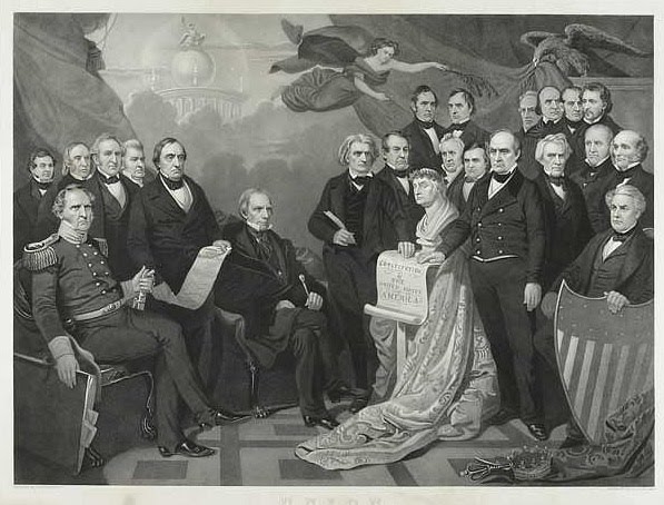
Though something of a simplification, one can group chromolithographs into three basic types. First are the chromos used primarily as book illustrations or inexpensive "art." These can run from very fine quality (such as Owen’s Grammar of Ornament) to colorful, workmanlike images (such as late nineteenth century natural history book illustrations) to “cheap and cheerful” (like the many inexpensive prints intended for framing from the 1890s). Generally these chromolithographs were printed in the thousands and so are generally available today at reasonable prices. While not really “fine art” nor “collectible,” these can provide very nice prints for decoration.

The second type are sometimes called “French style” chromolithographs. These are prints which are intended to duplicate watercolors or paintings using translucent inks which create an image that has an airy texture and a soft blending of colors. This process can create lovely images which often look much like the original artwork.

This type of print became very popular with artists in the 1880s and 90s. In this period a number of series of this type of chromolithograph were published with prints of sporting images by American artists, intended for framing and designed to help generate income for the artists and publishers. Among the most famous of these series are Alexander Pope’s Upland Game Birds and Water Fowl of the United States, Frederic Cozzens’s American Yachts, Their Clubs and Races, A.B. Frost’s Shooting Pictures, and the portfolio Sport, or Fishing and Shooting, with prints by a number of important American sporting artists.

These prints could be kept as a “book,” but really they were issued mostly in portfolios (loose prints with covers) rather than bound as books. The primary intent was for these prints to be framed and that is how most of them survive to today. These prints sometimes were issued with titles printed on them, but more often the prints were published with the paper trimmed to the images, with any title on the cover or a separate label. These prints were intended to be framed so that they looked like original paintings or watercolors and they can still be used to that end. [ Click here to see an Antiques Roadshow appraisal of prints from A.B. Frost's sporting portfolio ]

The final type of chromolithograph is my favorite. These are prints that were intended to duplicate oil paintings (sometimes called the "German style'). The inks used were heavy, oil-based inks which when applied in several layers give a texture like that of an original oil painting. These prints were almost never printed with any text on them (though sometimes the title or a name might appear unobtrusively at the bottom of the image), they were usually issued with no margins, and often mounted either on a canvas backing or a board. They were also almost always sold in a frame (sometimes quite elaborate) without glass. Altogether this makes their appearance very close to that of an oil painting.

These prints are the ones that were designed to be sold to the middle classes so that they could hang these faux paintings in their home and benefit both from their sophisticated look and from being able to enjoy and learn from the artwork. Many fine paintings by American artists were issued in this format, such as Frederick Church’s Niagara Falls, Albert Bierstadt’s Sunset & Sunlight and Shadows, Jasper F. Cropsey’s American Autumn, and Thomas Moran’s Grand Canyon of Arizona. It was as much through the chromolithographic copies of these and other seminal American paintings, as opposed to the exhibition of the original work, that this art was disseminated to the general public.

The leading proponent of this sort of chromolithograph was Louis Prang of Boston. Prang's chromos, which were "sold in all Picture stores," were highly praised and became hugely successful. Prang did more to create the market for chromolithographs in America than any other publisher, and his work also greatly shaped the output of other publishers around the country.

Prang's initial success came from his many small prints ("art bits"), which were collected by the public and usually kept in albums. He also developed a market for color printed specialty items like Christmas cards, which he is credited with inventing. Beginning in the late 1860s, Prang launched a magazine, Prang's Chromo: A Journal of Popular Art, and he began to issue chromolithographic copies of American paintings, which he called "Prang's American Chromos." He later expanded his output to include European paintings such as Correggio’s Magdalena. His first great success was with Eastman Johnson's Barefoot Boy, and eventually he issued about 800 chromolithographs of this sort, establishing an oeuvre unmatched by any other American chromolithographic publisher.

There were other publishers who issued these oil-like chromolithographs, such as Charles H. Crosby, Colton, Zahm and Roberts, F. Tuchfarber, and the British firm of Thomas McLean. And there were also many firms which issued other types of chromolithographs, ranging in quality from poor to top notch. We try to carry in our shop as many chromolithographs as we can, both images by important American artists and charming anonymous genre prints. It is interesting that when we hang a good quality art chromolithograph in our booth at an antique show, it is not infrequently mistaken for an oil painting (as, of course, was the original intent). What is sad is that when I explain that no, this is not an oil painting, but instead it is a fabulous example of chromolithography, the viewer often loses interest. To me, the chromolithographs are as interesting and attractive as the oil paintings, and certainly are more affordable.

I’ll keep beating the drum for chromolithographs and hope an appreciation of these fine prints will spread. Towards that end, there are some excellent reference books that one can read on these prints. The seminal work, and the one which really began the renaissance in appreciation of chromolithographs, is Peter C. Marzio’s terrific The Democratic Art . Katharine M. McClinton’s fine The Chromolithographs of Louis Prang and Jay Last’s The Color Explosion are also books anyone interested in the subject should read.