After the Louisiana Purchase, the U.S. Government was interested in trying to get a basic understanding of what was in the vast new lands the country had acquired. Towards that end, the government sent out a number of surveys in the early nineteenth century. These included the Lewis & Clark expedition of 1803-1806, Zebulon Pike’s of 1806-07, and that of Stephen H. Long in 1819-20.
The Long expedition ended the official exploration of the West for about two decades, until finally in 1838, the U.S. Army established the Corps of Topographical Engineers, the purview of which included exploring and mapping the West. Among the most important of their surveys were the five expeditions led by John C. Frémont between 1842 and 1853.
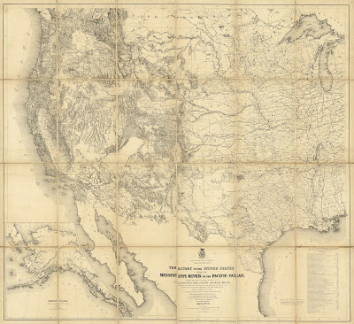
After mid-century, exploration of the West picked up significantly when in 1853 Congress authorized $150,000 for the exploration of possible railroad routes across the continent, creating the Pacific Railroad Surveys to investigate possible routes across the West at four different latitudes. The results of these surveys were depicted in G.K. Warren’s important “Map of the Territory of the United States from Mississippi to the Pacific Ocean,” which summed up the government’s understanding of the West on the eve of the Civil War.
After the Civil War, the nation turned its attention even more to the American West, which was seen as an area of huge potential economic development. This led to a demand for better information on the region, a demand that was partially met by the General Land Office. The GLO was responsible for the surveying, platting and sale of public lands, so while their surveys were very important for the economic development of the West, there were large sections of the region they did not cover.
The Federal government was particularly interested in the economic resources of the West, which had not been a focus of the earlier military surveys. Thus, the government modified its surveys so that were more scientific, rather than military. These were called “geological” surveys, “geology” at the time having a wider definition than now, referring broadly to the science of the earth, including within its compass botany, soil science, archaeology and anthropology.
The first government survey dedicated to studying the geological, and thus economic aspects of a far western state was the 1860-74 California Geological Survey led by Josiah D. Whitney. This survey is important for several reasons, not the least of which was the new procedure for surveying alpine landscapes developed by its lead topographer, Charles Frederick Hoffmann.
The California Geological Survey established the methods and aims for future surveys by the U.S. Government, which in 1867 authorized the first in a series of systematic scientific surveys of the West. These became known as the “Four Great Surveys,” which ran pretty much concurrently and lasted until 1879.
King Survey (1867-73)
The first of these surveys, authorized on March 2, 1867, was the U.S. Geological Exploration of the 40th Parallel, led by Clarence King, who had worked on with the California Geological survey. The purview of the King party was to survey the lands on either side of the Pacific Railroad from California to eastern Wyoming and it was designed primarily as a practical survey to determine the economic potential of the lands along the railroad route.
The King survey resulted in the publication of a
Geological and Topographical Atlas in 1876. This included a general map, then five each of topographical and geological sectional maps in sequence along the route of King’s survey. The maps were done in very large size—most sheets measure 29” x 42”—these are rare and fascinating images of the western part of the lands on either side of the 40th parallel.
Hayden Survey (1867-79)
The second of the Great Surveys began the same year as the King survey. This was led by Ferdinand V. Hayden and though it started off focused on Nebraska, within two years it became the U.S. Geological and Geographical Survey of the Territories. Hayden’s survey eventually encompassed parts of Nebraska, Wyoming, Idaho, Montana, and particularly Colorado.
Hayden issued yearly reports and these standardly include illustrations as well as maps of the different areas he surveyed. The most impressive of his cartographic publications was the 1877
Geological and Geographical Atlas of Colorado, which included four general maps of the entire state, as well as topographical and geological maps of the state broken into six sections. These provide the first comprehensive and accurate mapping of the Colorado, just a year after statehood.
Powell Survey (1870-78)
The third of the four Great Surveys was the U.S. Geographical and Geological Survey of the Rocky Mountain Region led by John Wesley Powell, a survey which lasted from 1870 to 1878. Powell had become convinced that the Colorado River canyons could be explored only by boat, so in 1869, Powell formed a private expedition and set off down the Green and Colorado Rivers. The expedition members are the first known Euro-Americans to traverse the Grand Canyon.
As the 1869 expedition ended up being more about survival than science, and as much of the data he had gathered was lost, Powell asked Congress to authorize another exploration of the Grand Canyon. This Congress did with the creation of the third of the Great Surveys, the scope of which was not only the Grand Canyon, but also the surrounding plateau lands. Powell was involved in the production of a number of maps, some of which appeared in reports from this survey, but there was no major cartographic publication which resulted.
Wheeler Survey (1872-79)
The last of the four Great Surveys was under the command of Lieutenant George Montague Wheeler. Wheeler had led surveys in eastern Nevada and Arizona in 1869. These were under the aegis of the U.S. Army’s Corps of Engineers and the surveys had primarily military objectives. By 1870, with the creation of the other three, essentially civilian surveys, the military became concerned that the job of mapping the American West was being taken away from them. Wheeler came up with the idea of having the Army survey the entire country west of the 100th meridian. The Army bought into this concept and convinced Congress that this was a good idea, so in 1872, money was appropriated to form the U.S. Geographical Survey West of the 100th Meridian.

Wheeler was never able to complete his work, though he did map a large portion of the West by the end of 1879, covering about 360,000 square miles, though that was only about on quarter of the area originally intended. Beginning in 1876, Wheeler issued a number of maps, along with a title page for a “Topographical Atlas.” The idea was that Wheeler would issue maps as the survey progressed, with the sheets eventually all gathered into this atlas. This did not happen; the intended atlas was never completed. Over the years, however, Wheeler did continue to produce maps, most sheets showing one quarter of one of his 95 quadrangles. Each year Wheeler also produced a progress map illustrating the areas that had been surveyed. Wheeler stopped surveying in 1879 but continued to issue reports and maps until 1884.

In the end Wheeler produced 71 topographical maps. Initially he was criticized for not showing enough information about the natural resources of the areas mapped, so Wheeler started to add economic or land-use maps, as well as some geological maps. Craig Haggit, of the Denver Public Library, has produced a very nice web page about the Wheeler maps, which can be seen by
clicking on this link.
Competition between the surveys
It is not really surprising that right from the beginning there was competition between the Four Great Surveys, as they ran pretty much concurrently and covered overlapping areas of the West. There was a conflict between the military and civilian surveys, the military wanting to have authority over the western surveys and the scientific community wanting the same thing. There was also conflict over getting money from Congress, as there were limited funds and each survey wanted to make sure they received sufficient appropriations. Finally, there was conflict over the scope of each survey. For instance, at one point Powell tried to extend his survey to encompass the entire Rocky Mountains, but Congress demurred, saying the Rockies belong to the Hayden survey.
The most consequential of the conflicts was between Hayden and Wheeler, whose territories did overlap. This came to a head on July 9, 1873. Wheeler had sent a party, under Lieutenant W.L. Marshall, to survey south-central Colorado and at the same time Hayden had sent one of his survey parties into the South Park area, which was just where Marshall was working.
Hayden describes what happened:
“As we were riding down into the south Park, about the 9th day of July, we came across Lt. Marshall’s party and we camped together. He was a very courteous gentleman and we were very friendly. We talked matters over, and some regrets were expressed that we were on the same ground. I simply stated to him...that I had no option but to perform this work and we had had the Territory of Colorado assigned to us as a field of exploration. He simply said that he was under orders, and therefore could not disobey his orders.”
As a result, both parties set about surveying the same area in a ridiculous duplication of effort.
It was inevitable that this conflict would come to the attention of Congress. This happened when the War Department demanded an investigation in hopes of asserting its authority, through the Wheeler survey, over all the surveys of the West. As a result, the following year, the Townsend Committee on Public Lands of the House of Representatives met to consider the conflict.
One tack taken by the military was to attack Hayden personally. Marshall accused Hayden of rushing into the area specifically to preempt Wheeler (which may or may not be true). Also, supposedly, as reported by Wheeler’s geologist, Hayden was quoted as having said, “You can tell Wheeler that if he stirs a finger or attempts to interfere with me or my survey in any way I will utterly crush him—as I have enough congressional influence to do so and will bring it to bear.”
Despite these attacks, Wheeler and the military were for the most part on the defensive, as the entire scientific community backed Hayden. Wheeler’s process and maps were assailed, with Hayden’s worked stated as being much better. However, Wheeler had the backing of President Grant and in the end the Congressional committee did nothing, concluding that “there is an abundance of work for the best talents of both the War and Interior Departments in the scientific questions of the Western Territories for many years to come.” Still the committee did reprimand Hayden and Wheeler for “ill-judged and hasty expressions...which good taste would have withheld.”
The problems of having so many concurrent government surveys in much the same area persisted. The concern over this was aggravated by the rising costs of the surveys, so in the spring of 1878, the House Committee on Appropriations undertook to see if the surveys could be consolidated and condensed. At this stage, the King survey was already done, but Hayden, Powell and Wheeler were all still in the field.
In the end Congress decided that the General Land Office was to continue to survey public lands, the Coast and Geodetic Survey would continue to do “first-order triangulation of the whole country,” but a new “U.S. Geological Survey” was to “assume all surveying, mapping and geological investigations in the West.” As a result, on March 3, 1879, the U.S. Geological Survey was established, replacing the remaining three Great Surveys and beginning a new chapter in the surveying of the American West.