Last week I attended a breakfast meeting at the Denver Public Library about their new Creating Communities project. This is a terrific program which is designed to make the historical resources of the library, as well as those from other affiliated institutions, accessible to the general public through the Creating Communities web site. As a die-hard believer in the use of historical material to promote knowledge and understanding of our past, and so also of our present, I was delighted to find out about this program.
First a word about the Denver Public Library. Until this summer, I lived for the last three decades in Philadelphia, which has one of the oldest and best public library systems in the country, so I was very pleased to find that the Denver library system is also absolutely first rate. The library was established in 1889, the city librarian calling it a “center of public happiness.” In 1910, a new Central Library building was constructed, and then over the next decade eight branch libraries were built, all with the generous help of Andrew Carnegie. As the library system matured, new branches were opened, old ones refurbished, and in 1995 an outstanding new Central Library was built, designed by Michael Graves.
I am a fan not only of libraries, but also of institutions which hold collections of prints & maps. It turns out that in Denver the public library is the institution in this area with the best collection of historic printed images, a collection held in the Western History and Genealogy department. Their collection of Western Americana is, without question, one of the best in the country.
Opened in 1935, the Western collection was initially intended to focus on books by Colorado authors, but soon the department broadened its focus to encompasses all phases of the development of the trans-Mississippi West. To quote the library web site, “[t]he collection continues to grow and presently includes 200,000 cataloged books, pamphlets, atlases, maps, and microfilm titles. In addition, it offers 600,000 photographs, 3,700 manuscript archives, and a remarkable collection of Western fine art and prints to researchers across the world.”
Among the collections in which the library is particularly strong are publications of Western railroads, reports and maps of Colorado mining companies, trade catalogs, records and printed memorabilia of Buffalo Bill's Wild West shows, frontier theater programs, land grant materials, Colorado territorial imprints, architectural drawings, and extensive clipping files of local newspapers. The maps and atlases, of which there are about 6,000, and the historical views are, of course, of particular interest to me. The Western Collection is a place I plan to spend much time researching.
As with any library, one of the main goals of the Denver Public Library is to reach out to the community, both to provide it with access to its resources, but also to stimulate curiosity and increase knowledge. That is what Creating Communities does. Other local institutions are also involved in the project, including the City of Denver, History Colorado, the Auraria Library, the University of Colorado at Denver, and the University of Denver Penrose Library. This program makes available on the web many of the resources about Denver and its history from these institutions. One of the main parts of the web site is a section with information on seven of Denver’s historic neighborhoods, and many of the Western Collection’s archival materials, in digital form, are also available through the site, including property maps of the city.
An interesting part of the program is “myDenver”, which is designed to allow the general public to upload photographs and stories of their own, and to be part of an ongoing conversation about their city. The further development of myDenver is one of the main goals of the Creating Communities program going forward.
I was rather spoiled by the extensive institutional riches of Philadelphia and I was a bit concerned in moving to “the West,” that I would be bereft of this important type of resource. I was, as I should have known, mistaken in this, for Denver not only has its own rich history (though not as long a one as Philadelphia) but also its own wealth of historical material which available to me and to anyone else with an interest in the history of this wonderful city.
Wednesday, December 22, 2010
Monday, December 13, 2010
Peter Marzio
I just learned of the passing, on December 9, of one of the superstars of the print world, Peter C. Marzio. Peter was the director of the Museum of Fine Arts in Houston, a post he held for almost three decades, and he was instrumental in helping build the museum into a world-class cultural center. He died last Thursday from cancer at age 67, much too soon.
Peter's was something of a rags to riches story. He was born into a working-class immigrant family, becoming the first in his family to graduate from High School. At Juniata College he became inspired by the art and museum world, deciding to make this his career. He went on to earn a doctorate in art and American history from the University of Chicago. He served as curator of prints and drawings at the Smithsonian and then as director and chief executive officer of the Corcoran Gallery of Art, before becoming the director in Houston.
Peter is best known to the general public for his art scholarship, educational programs and for his dynamic leadership of the Museum of Fine Arts, Houston. However, for those in the print world, Peter is "the man" when it came to chromolithography. As I have mentioned many times in this blog, I think chromolithographs of the nineteenth century are among the most interesting and over-looked American prints and it was Peter's work which turned me on to these wonderful prints.
In 1979, while director at the Corcoran, Peter Marzio wrote his superb book on American chromolithographs, The Democratic Art. Pictures for a 19th-Century America, , as well as curated an exhibition on the subject at the Amon Carter Museum of Western Art. This was the first time that a serious work on American 19th-century chromolithographs was published and that a major exhibit on the subject was put on.
The books is tremendous and when I first read it, it opened my eyes as to the fascination and importance of these hitherto overlooked prints. Peter wrote in his preface that "My deepest wish is that this book will help students to see the field of American lithography as worth of research." It certainly has done that, and while Peter contributed a huge amount else to the art world, if this was all he had done, his name would still be one revered among those with an interest in American prints. The world is a poorer place now than before his death, but much richer for his having been in it.
Friday, December 10, 2010
Audubon's Birds of America sets record price
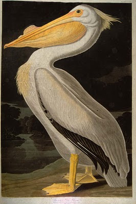
On December 7th, a beautiful, complete copy of John James Audubon's Birds of America sold at Sotheby's auction in London for a hammer price of 6.5 million pounds. With the commission charged by Sotheby's, this brought the total paid by the buyer to slightly over $11.5 million dollars! The work, complete with its 435 hand-colored aquatints bound into four volumes, sold to London art dealer Michael Tollemache. You can read the BBC report on the sale and watch an interesting video on the BBC News web site.
This is the most ever paid for a printed book, a record established both because Audubon is "the" great name in American natural history illustration, but also because this is a superb example of an extremely scarce book. Audubon's masterpiece was very expensive even when produced, so few were published. Just over 100 complete sets are known to exist, almost all of which are held in public institutions. The last complete set to go at auction sold for $8.8 million dollars in 2000.
It is interesting to note that when one takes into account inflation since 2000, the new record of $11.5 million is not a significantly higher price than was paid for the set a decade ago. So, I guess one can conclude that the value of this work is not really increasing that much. However, I would note that the economies of 2000 and 2010 are very different, so for the volume to even maintain its value is pretty impressive.
A sale of this magnitude is interesting to reflect upon. What is going to happen to this set? Will it affect the prices of individual prints? What does this say about the print market?
As to what is going to happen to the set, the new owner calls his set "priceless" and says that he will just keep it and enjoy it for a while, though he did not rule out eventually selling it. Frankly, I do not buy this (though it could, of course, be true). $11,500,000 is a lot of money for any dealer (unless Bill Gates decides to become an art dealer) to invest in something he is simply going to enjoy. My guess is that Mr. Tollemache already intends to sell or has already sold the set.
So, did the new owner buy the set with the intent of putting it on the market to see how it goes? I will say that I find it hard to believe the set was bought on speculation. Given that this is a very widely publicized auction price, and given that this is the most ever paid for a printed book, how much upside is there on the price that a dealer could ask? Certainly, even a small percentage, say 5%, is a lot of money ($575,000), but $11.5 million is a lot of money to put up front to make only half a million.
Now Mr. Tollemache made the surprising assertion that the amount he paid was well less than the amount one could get if one broke up the set and sold the prints individually (something his emphatically denied intending doing). This sure sounds a bit like a sales pitch to a prospective client (gee, Tom, just think, if your gold mines go bust you can always break the set and make a tidy profit selling them individually...).
However, Mr. Tollemache's claim is just not true. If one calculates the per print price of this set, it comes to about $26,500 per plate. That seems pretty reasonable when a good number of the better birds are bringing well over $100,000 each. However, if anyone has looked through the full set of Audubon images (you can do this even with the octavo set to understand this point), you will realize that there are a lot of prints of smaller or not terribly attractive birds where the prints sell on today's market for only around $2,000 each. And there are even more of these prints---of quite attractive and biggish birds---which sell for between $4,000 and $20,000, still under the average price of this set.
So, if you take out all these prints, the ones selling for under $20,000, the average cost of the remaining birds is much, much higher than $26,500. I have not calculated the exact figure of the 435 prints at today's retail, but I can tell you it will not be equal to, much less greater than, $11.5 million.
So, this raises a few questions: why did Mr. Tollemache make this implausible claim, what are his plans for this set, and how will this affect the market for Audubon prints? My guess to the first two questions is that Mr. Tollemache actually bid on this set for an unknown client. This would make a lot of sense, for if he is using someone else's money, then a small percentage profit would be great. This would also explain his comment on the break-up value, trying to make his client feel good about the purchase. It is even possible that Mr. Tollemache did the bidding for the client at only a token commission, as the publicity of being the buyer of this set is "priceless."
This is, I want to emphasize, pure speculation. I know nothing about Mr. Tollemache other than what I have read since the sale. My comments are also not really at all pejorative, for it would not be at all surprising if a new owner of this work would want to remain anonymous. Also if Mr. Tollemache is fibbing, it is a harmless fib and one of a sort that is not uncommon in the art world. I may be wrong, but it sure makes a lot more sense to me that Mr. Tollemache bought this for someone than that he bought it for himself.
As to how this sale will affect the market for Audubon prints, I think probably not a lot. First, as noted this price is not really that much higher than the 2000 price, when adjusted for inflation, so I do not think anyone is going to think all of a sudden that Audubon prints are worth more than they were. The publicity will increase interest in Audubon prints, but such increased interest does not often turn into an increase in sales/values. For instance, after Ken Burns' Civil War series appeared, there was a lot of increased interest in prints of the Civil War, but very little increase in sales of them.
I am, however, encouraged by the sale. Any publicity about an any prints helps raise the general awareness of the items with which I work, and that is great. Also, it shows that there is a belief that prints can be things which have a significant value and that even in today's economy they are worth investing in.
Labels:
Economy of prints,
Print events,
Value of prints
Wednesday, December 8, 2010
Thematic maps
A thematic map is a type of map which is designed to show a particular theme, other than geographic data, expressed onto a geographic base. Themes can include social, cultural, political, economic, agricultural, climatic, historical, or pretty much any other theme which has a presence in the physical world. Thematic maps differ from regular maps in that for the latter, the geographic information is the end in itself whereas for the former, it provides the context for the thematic data.
What thematic maps do is to give the viewer a unique way to look at quantitative information, which can provide insight not obtainable directly from the raw data itself. It is the nexus of the data and the geographic base which presents new patterns, which in turn can lead to a new understanding of the data and, in some case, important discoveries.
Perhaps the earliest extant thematic map is the Turin Papyrus, an Egyptian map from about 1160 BC, which was prepared for Ramesses IV’s expedition to Wadi Hammamat to obtain sandstone for his construction projects. The map shows the wadi with the location of gold deposits indicated, as well as the distribution of different rocks and gravels (by use of different colors and symbols), making this the first geological map.
Another early thematic map is the Peutinger table, a map based on a 4th-century Roman map. A 13th-century copy of the original map was discovered at the end of the fifteenth century and ended up with Konrad Peutinger (thus its name). The map shows Europe and parts of Asia and Africa, but the map is designed to show the roads and travel routes of the Roman legions, with each day’s march marked on the roads. It is very elongated, as the map is built around the Roman road system network which primarily ran east-west.
One of the most important figures in thematic mapping was British astronomer Edmond Halley, who published the first meteorological chart in 1686 and then a map of magnetic variation in 1701.
The most famous early example of thematic mapping was John Snow’s map of the incidents of cholera in London in 1854. Cholera was a serious and not-understood health issue in the nineteenth century. Snow decided to plot the incidents of cholera onto a map of the London neighborhood just north of Piccadilly Circus, upon which was also marked the water pump locations. The pattern which emerged clearly showed that the cholera incidents centered around a pump on Broad Street, indicating that this was the source of the epidemic. The pump was put out of commission and new cholera cases ceased. This was the first real indication that cholera was spread by tainted water and not through some air-borne medium.
Thematic maps use various techniques, such as the marks used by Snow, or applying different colors to represent different densities of the theme in question (choropleth maps), or the use of proportional symbols on a map, or isarithmic or contour maps, where a fixed data point of, say, precipitation or temperature, is mapped in a continuous line on the map (reminds me of what a map of Alcatraz by an ex-prisoner is called, a Con Tour map…).
While few thematic maps have had quite the impact of Dr. Snow’s, there have been many instances of important and fascinating thematic maps over the years. A nice book on the topic is Arthur H. Robinson’s 1982 Early Thematic Mapping in the History of Cartography.
The subject of this blog was inspired by a fascinating talk on thematic maps by Dr. Susan Schulten of the University of Denver. Her talk, “Disease Mapping and the Advent of Meteorology in America,” was presented as part of the Arts in Medicine program at the University of Colorado medical school. Susan looked at how the attempt to understand the nineteenth century epidemics of cholera and yellow fever involved the use of maps (the Snow map, obviously, featuring prominently), and how the success of thematic mapping in this arena extended its use to other areas of science, such as meteorology.
Susan (another example of the terrific network of map scholars who are members of the Rocky Mountain Map Society) is nearing completion of a book on thematic mapping. This is what she says about her project.... “The book I'm writing is a history of thematic mapping in the nineteenth century, looking at maps of the present but also the rising interest in old maps and maps of the past at that time. I'm closing in on a draft of the entire manuscript…. It will come out with Chicago, and will be accompanied by a website where high resolution versions of the maps will be available for close inspection.” I am looking forward to its publication and I’ll make sure to announce it in this blog when it makes its appearance.
Saturday, November 27, 2010
Miscellaneous
I am sitting in our new Denver branch, The Philadelphia Print Shop West, just a week after our "Grand Opening." We had a great party with lots of enthusiastic visitors, and my partner Don Cresswell was able to come to Denver to help with the opening and see how the new space worked out.
The shop space has turned out quite nicely, with everything easily viewed and lots of light. We haven't been here long enough that a lot of people are coming here specially to see us, but we have had good foot traffic and I am looking forward to the Christmas season. It is certainly interesting opening this branch, for it has been a long time since we were anything but a very established business. Starting up a new shop is both exciting and scary. However, so far I'm having fun!
Though I have been rather irregular of late in terms of keeping this blog up-to-date, it did get a nice mention in an interesting Interior Design blog written by Sharon Harlon. She put up a post on 40 Antique Shopping blogs. I have enjoyed looking at the other antiques blogs she listed and, of course, it is always nice to get a plug...
And then I was also surprised and pleased that this blog was selected as one of the Best 50 Antiques Blogs on the Guide to Art Schools web site. This site is designed to assist prospective art students and it is great that the authors of the site are interested in my blog and antiques in general. It is a common complaint among antique dealers that the "young" are not interested in antiques, but this shows that this is not true. This shows that antiques can appeal to all ages if presented in the right way.
One other blog I came across recently of interest is "Franky's Scripophily BlogSpot," which concerns antique share certificates. Something I never realized is how many of these certificates depict maps. The blogger, Franky Leeuwerck, has put up a number of interesting posts on the subject of maps on share certificates. Worth checking out...
One final subject I wanted to mention is my great pleasure in now being in proximity to the Rocky Mountain Map Society. The Print Shhop has been a member for years, but now I am able to get to know its many members and attend the lectures. Earlier this month there was a terrific lecture on Alexander von Humboldt by Dr. Imre Josef Demhardt. The membership of this society is very active and many members are extremely knowledgeable about maps, especially those of Colorado and the American West. I will write this up more extensively down the road, but I will mention that in the works is a joint project for July 2012 between the Rocky Mountain Map Society, the Denver Public Library, the University of Denver, and the Texas Map Society, which will include a map symposium followed by a reprise of the Map Fair of the West. Lots of exciting stuff going on out here in Denver...
The shop space has turned out quite nicely, with everything easily viewed and lots of light. We haven't been here long enough that a lot of people are coming here specially to see us, but we have had good foot traffic and I am looking forward to the Christmas season. It is certainly interesting opening this branch, for it has been a long time since we were anything but a very established business. Starting up a new shop is both exciting and scary. However, so far I'm having fun!
Though I have been rather irregular of late in terms of keeping this blog up-to-date, it did get a nice mention in an interesting Interior Design blog written by Sharon Harlon. She put up a post on 40 Antique Shopping blogs. I have enjoyed looking at the other antiques blogs she listed and, of course, it is always nice to get a plug...
And then I was also surprised and pleased that this blog was selected as one of the Best 50 Antiques Blogs on the Guide to Art Schools web site. This site is designed to assist prospective art students and it is great that the authors of the site are interested in my blog and antiques in general. It is a common complaint among antique dealers that the "young" are not interested in antiques, but this shows that this is not true. This shows that antiques can appeal to all ages if presented in the right way.
One other blog I came across recently of interest is "Franky's Scripophily BlogSpot," which concerns antique share certificates. Something I never realized is how many of these certificates depict maps. The blogger, Franky Leeuwerck, has put up a number of interesting posts on the subject of maps on share certificates. Worth checking out...
One final subject I wanted to mention is my great pleasure in now being in proximity to the Rocky Mountain Map Society. The Print Shhop has been a member for years, but now I am able to get to know its many members and attend the lectures. Earlier this month there was a terrific lecture on Alexander von Humboldt by Dr. Imre Josef Demhardt. The membership of this society is very active and many members are extremely knowledgeable about maps, especially those of Colorado and the American West. I will write this up more extensively down the road, but I will mention that in the works is a joint project for July 2012 between the Rocky Mountain Map Society, the Denver Public Library, the University of Denver, and the Texas Map Society, which will include a map symposium followed by a reprise of the Map Fair of the West. Lots of exciting stuff going on out here in Denver...
Wednesday, November 10, 2010
Wall maps
Since the earliest days of civilization, maps have been useful items which have been created in many different formats. From the earliest ephemeral maps drawn in the dirt, on papyrus or constructed from sticks, to the more permanent maps engraved in clay or stone, maps later appeared on metal plates, made up of tiles, drawn on vellum and paper and finally, beginning in the fifteenth century, printed on paper. It was this last format which proved to be the most affordable and practical. However, even within the range of printed maps on paper, maps appeared in many different formats. The most common that survive to today are those which were issued inside books or atlases, but others were produced which were separate broadside maps, folding saddle-bag and pocket maps, and wall maps. In this blog I will take a look at wall maps.
As maps were usually created to serve practical purposes, it made sense to produce maps which could be examined conveniently by a number of people. The best format for this use was the the large format wall map. By mounting a map onto a wall, one could allow viewers, several at one time, to easily study a map of quite large size. These wall maps were usually comprised of several sheets of paper mounted together on a backing fabric and then suspended from rods and hung on the wall. Often, especially in the nineteenth century, the maps were varnished to protect the surface from fingers, insects, smoke and other damage.
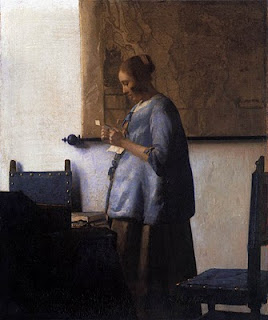
These maps first seem to have appeared in the seventeenth century and they were fairly common in the homes and workplaces of the wealthy Dutch, as demonstrated by some of Vermeer's famous paintings. The maps were likely used in the libraries or offices of the wealthy and nobility throughout Europe in that and the following century, and wall maps also hung in many places in America in the eighteenth century, for instance in the Governor's Palace in Williamsburg, Virginia.
By the nineteenth century, wall maps were used throughout the United States. They hung in government offices, public meeting places, schools and in some homes. Early on in the century, wall maps showed the expanding country, with its natural features and political divisions, roads, canals and then railroads. As these maps were specifically designed for practical use, and because their large format made careful study of details more likely, map makers were careful to update their maps regularly to keep them as current and accurate as possible. This can be seen by the two examples of S. Augustus Mitchell's "New National Map of the United States" above (the one of the left is 1856 and the one on the right 1862).
It was usually economic factors which drove the creation of these elaborate, large and expensive-to-produce wall maps. As local economies became stronger in the second half of the nineteenth century, local wall maps began to appear more regularly. County maps and city maps were produced of many prosperous communities. These tended to show not only the natural features and transportation nexus of the areas depicted, but also indicated many of the local land owners.
Most of the local wall maps one comes across are from the east coast or mid-west, for not only was this where most map publishers were located, but these regions had dense populations and economic development, making local maps of greater use. It was thus a wonderful surprise when I recently came across a fabulous 1873 wall map of Marin County, California. This map was drawn by F. Whitney and published by A.L. Brancroft of San Francisco. It is a very early and rare example of a wall map from California.
One particularly cool thing about the Marin County map was that on the back of it (it is still on the original backing) was a stamp for the San Francisco firm "W.D. Walkup & Co. Map, Chart & Card Mounters." I have never seen a "map mounters" label from anywhere, much less San Francisco. My guess is that most of the work for Walkup & Co. was for sailing charts as these were universally backed onto linen so they could be easily handled and rolled for storage. The "cards" which the label refers to are probably advertising cards, like those mentioned in the previous blog on Philadelphia prints.
This map is particularly rare, but all nineteenth century wall maps are rare. These maps were, as I have said, generally hung in public spaces intended for general use. This led to much "handling" which would naturally cause them to deteriorate. Also, hanging in the open made them subject to sun, moisture and insects, all of which would take their toll. Also the varnish typically used on the front of the maps and the glue used to attach the paper to the linen backing caused these maps to deteriorate over time. Finally, when these maps became out of date, they were often rolled and left in a corner or on the floor, where they could get mishandled or have water drip on them. It is rare to find nineteenth century wall maps at all, but when one does find them they tend to have flaking of the surface and stains, sometimes quite extensive.
Unfortunately, it is a considerable job to fix these maps. The varnish needs to be removed, the map lifted from the old backing, the paper conserved, and then put back down--often with the sections having to be pieced together--onto new linen. This makes the whole process expensive and so many of these maps are not restored. I remember back in the 1980s seeing a large pile of rolled wall maps in a major map library. The maps were falling apart more and more each year because there were no funds available to fix them. Luckily, the values of these maps have gone up enough in the last decade or so that now it makes more sense for owners or map sellers to conserve the maps.
I think wall maps are some of the most interesting antique maps of all. They are fascinating to study, often highly decorative, and one of the best ways for us to see our past through our ancestor's eyes.
Monday, October 18, 2010
Representations of Economy at Library Company
I spent last Friday at a terrific print conference at the Library Company of Philadelphia. Entitled "Representations of Economy. Lithography in America from 1820 to 1860," this conference was sponsored in part by "Philadelphia on Stone," which I have discussed in an earlier blog. Philadelphia on Stone is a project under the auspices of the Visual Culture Program at the Library Company (VCP@LCP), which joined up with the Program in Early American Economy and Society (PEAES) to put on the conference.
A lot of confusing names of programs, I know, but this conference is a great example of the exciting results of new programs and collaborations which have been appearing at the Library Company and elsewhere. VCP@LCP is a program which promotes the study of historical images as primary source material (note that the images in this blog are all from the image data base they have put up on the Philadelphia on Stone web site). If you have read this blog regularly you will realize is a thing I am very keen on. As Cathy Matson, director of PEAES said, historic images are not just supplements to textural history, but they are primary sources which can provide unique information and insights.
PEAES is a project from LCP which is dedicated to the promoting of the study of early American economy, broadly understood. The two programs obviously overlap considerably and it was in that area of overlap that this conference was conceived.
The period between 1820 and 1860 was one of tremendous change in the American economy, with the country moving from a primarily agrarian/rural society to an industrial/urban one. In this period, lithography made its appearance and grew to be the dominant printmaking medium. Lithography was not only a product of the changing American economy but it also graphically reflected that metamorphosis. Even more, in a period when many were illiterate or did not speak or read English, pictures provided them with much of their understanding of their world. Thus, these historic images helped to both form and disseminate the culture of the period. Last week's conference examined these and more of the fascinating aspects of American lithography in this period.
As an introduction, we were treated to viewing a film posted on YouTube which explains and demonstrates the process of lithography. It is worth viewing for anyone interested in how lithographs are made and can be seen here.
All of the talks were stimulating. I learned a lot and ended the day with a load of questions I'd like to pursue, including:
- How were the large "trade cards" (really advertising broadsides) of Philadelphia businesses used? We they posted in public spaces, sent out to resellers, put in shop windows, or used to adorn the boxes or packages the goods were sold or shipped in? No one really knows how they were used and there are few, if any, images showing them being used, so there are lots of possibilities to consider.
- I'd love to learn more about on how popular prints were sold. Gigi Barnhill and Nancy Finlay both discussed the business of print selling by popular print makers, but there is much more to learn.
Without spending far more time than I can spend on this blog, I can only skim over some of the topics and questions generated by the conference. The conference was a great example of how current scholars are using historic prints to not only increase our knowledge of our past, but also to open up new avenues to explore.
In finishing I have to mention another conference which is coming up in just a couple weeks that I know will prove to be just as stimulating and educational as last week's.This is the annual conference of the Center for Historic American Visual Culture at the American Antiquarian Society.
Last year I was able to attend this conference (and wrote a blog about it), and I wish I could go again this year, for it is on a topic which I think is great fun: "History Prints. Fact and Fiction." The conference will take place in Worcester, MA, on November 12 and 13th and it will be well worth attending for anyone interested in historic prints. Registration is open until October 29th. More information can be found here.
Tuesday, October 5, 2010
Georges Louis Leclerc, Comte de Buffon
Finally I have a little time to put up a post about prints... Today I'll look at the “Buffon” prints, which are some of the most ubiquitous and delightful natural history prints there are.
">
Georges Louis Leclerc, Comte de Buffon (1707-88), was an amazingly talented man, whose studies ranged from natural history through mathematics, astronomy, and all the sciences. His name was legendary in the eighteenth century, a vital period for natural history: he was to France what Linnaeus was to Sweden.
Buffon, as he is commonly called, was the keeper of the Jardin du Roi, the precursor of the Paris Zoo. He decided to undertake a prodigious task, that is to describe the entire animal kingdom. The result was his Histoire Naturelle, which was first issued in 35 quarto volumes between 1749 and 1788. This became the most influential natural history of the 18th century. It contained Buffon's text and illustrations of numerous natural history objects by different artists. The latter are engravings, many hand colored, which have made Buffon famous among print collectors today.
The Histoire Naturelle was issued in many different editions and his words and the illustrations were copied by other publishers over the years. Among the most famous of the “Buffon” prints that appeared are the bird prints engraved by Francois Nicolas Martinent , but there are many other subjects by many other engravers which appeared in the many editions of Buffon. These are delightful graphically, but of particular interest is that they provided the main visual knowledge for most educated Europeans about what the world's animals and birds looked like.
Buffon’s natural history theories were very influential in his own day, though some were controversial. In particular, his argument that New World species were inferior to those of the Old World caused much umbrage among Americans. Buffon argued that because of the marsh odors and dense forests in America, the New World species (including humans) were degenerate forms of Old World species.
Thomas Jefferson, who was the American ambassador to France, was so peeved by Buffon’s stance that he determined to show Buffon the true “stature and majesty of American quadrupeds.” Jefferson therefore had the complete skeleton, skin and horns of a Moose shipped to him in Paris and mounted in his hotel!
Subscribe to:
Posts (Atom)