Thursday, February 25, 2010
Boston Athenaeum
New England is the home of some of the best institutional print collections in the country. I have already written about the Connecticut Historical Society and the American Antiquarian Society, and today I will talk about another New England institution with a world-class antiquarian print collection, the Boston Athenaeum.
For almost three decades, Sally Pierce was the Athenaeum's Curator of Prints & Photographs. Sally is a superb print scholar, author (and wonderful person), who helped to turn the print collection at the Athenaeum into one of the best in the country. From 1991, Sally was assisted by Catharina Slautterback, who also co-authored a number of publications with Sally. When Sally recently retired, it was natural that Catharina would succeed her as Curator of Prints & Photographs. The Athenaeum was very lucky to be able to pass on the baton to such a capable, knowledgeable and experienced successor. Catharina has graciously agreed to be interviewed in this blog about the Athenaeum and its collection.
What is the history of the Athenaeum’s collection?
The Boston Athenaeum was founded in 1807 as a library, art repository, natural history museum, and laboratory. In the 1820s, the Athenaeum opened an art gallery, one of the first public venues for exhibiting art in New England. Although paintings and sculpture were the focus of both the Athenaeum’s art collection and its exhibitions, works of art on paper were routinely acquired and displayed. Most of the prints were acquired through donations and ran the gamut from European portraits, landscapes and city views to locally produced engravings and lithographs. Although several important early American artists, such as David Claypoole Johnston, Benjamin Nutting, and Seth Cheney, were nominally in charge of the “Engraving Room,” there was no clear collecting policy or curatorship in the modern sense of the word. The collection grew accordingly with the exquisite and the mundane coexisting in less than ideal housing environments. In the 1870s, the majority of the Athenaeum’s art collections were put on long term loan with the newly formed Museum of Fine Arts Boston and the Athenaeum focused on its mission as a library. Throughout the remainder of the nineteenth century and well into the twentieth century, works of art on paper were purchased primarily, although not exclusively, for documentary purposes, i.e. as art or geographical references.
The haphazard growth of the Athenaeum’s prints and photographs collection, so typical of the times, changed dramatically in the mid-twentieth century. In 1943 Charles E. Mason, Jr. and others founded the New England Historical Art Society to promote the study of the “history and customs of New England as portrayed in paintings, prints, engravings, sculpture, and other works of art.” The Society was one of a number of organizations and individuals that sought to challenge existing prejudices against American art and specifically American prints. In 1949 the Society was dissolved and its collection donated to the Boston Athenaeum, thus forming the nucleus of an independent prints and photographs department within the institution.
The Athenaeum’s collection was thus transformed from a large, but loose, assortment of prints and photographs to a tightly focused collection documenting New England culture, history, and printmaking. In its early years, the Department benefited from the guidance and generosity of Charles E. Mason, Jr., known affectionately as “Monk,” and one of the earliest and most enthusiastic collectors of American prints, particularly Boston lithography. Sally Pierce became Curator in 1981 and under her stewardship, the Prints & Photographs Department expanded to become one of the nation’s most significant collections of early American works of art on paper. I joined the Athenaeum in 1991 and assumed the curatorship of the Department following Ms. Pierce’s retirement in 2009.
What is the range of prints in the Athenaeum graphics collection?
Today, the Athenaeum’s Prints & Photographs Department is an active and vibrant member of the American print world. The collection is consulted by researchers around the world and individual items are exhibited and reproduced on a regular basis. The collection is comprised of works of art on paper documenting New England and American history from the eighteenth century to the present. Although classified as a historical documentation collection, many of the Department’s objects also have great artistic and aesthetic merits.
Its holdings include the graphic work of artists as diverse as Paul Revere, John Carwitham, Abel Bowen, Winslow Homer, Fitz Henry Lane, and William Morris Hunt. All manner of printmaking is documented within the collection, from aquatints and etching, to mezzotints, lithographs, and the four-screen processes of the early twentieth century. The subject matter of the collection is equally diverse with portraits, landscapes, genre scenes, urban and factory views, as well as significant holdings in Civil War-related imagery. In addition to prints, the Prints & Photographs Department actively collects photography, drawings, watercolors, posters and architectural drawings. A fuller description of the Department’s holdings can be found on the Athenaeum’s website.
What do you see as the greatest strength of the Athenaeum graphics collection?
The greatest strength of the Athenaeum’s Prints & Photographs Departments is undoubtedly its collection of nineteenth century Boston and New England lithographs. Boston was a center for the lithographic arts from the 1820s to the 1880s and home to such important firms as Pendleton’s, J. H. Buford’s, and Louis Prang. These firms produced a wide range of material: letterheads, sheet music covers, advertisements, political cartoons, playbills, and “art” chromolithographs. The Boston Athenaeum collects all of these materials and, in the process, documents not only the history of printmaking in America, and specifically in New England, but also the cultural, political, and social milieu of the nineteenth century.
What part of the graphics collection would you most like to strengthen?
I am always looking to strengthen the Athenaeum’s collection of eighteenth and early nineteenth century prints in order to supplement our understanding of American printmaking. And I am continually adding to the Athenaeum’s nineteenth century lithographic collection. I am particularly interested in the work of three Boston lithographers.
The short-lived firm of Tappan & Bradford (later L. H. Bradford & Company) produced some of the most beautiful examples of the lithographic arts with a fineness of draftsmanship and subtle tonal printing unparalleled at the time.
The chromolithographic work of Charles H. Crosby & Company is little known today; his output has been overshadowed by the more prolific and financially successful firm of Louis Prang. Crosby was an appalling bad businessman (he went in and out of bankruptcy several times) but he employed highly skilled artists and his firm produced some of the most ambitious and creative chromolithographic advertisements of the day. His work is fairly scarce and I would love to be able to document the full range of his work.
One of my favorite lithographic artists of the nineteenth century is the great portraitist, Leopold Grozelier. Although he died at the young age of thirty-five, he was incredibly prolific. The Athenaeum has over 80 portraits by Grozelier but I would like to continue to add to our holdings; it would be particularly interesting to acquire examples of prints that he executed in France before immigrating to the United States in 1851.
Is there any one print or type of print not in the collection that you would like to add?
Like most curators, my desiderata, or want, list is endless and I can think of several examples of prints and type of prints that I would like to add to the collection. For example, the Athenaeum has not traditionally collected color wood cut prints of the early twentieth century. There was a particularly vibrant community of wood cut artists in New England at this time and it would be wonderful to add some of their work to the Athenaeum’s collection.
In addition to adding new objects to the collection, curators must often “upgrade” their existing historical prints. This is not discussed very often but in fact many eighteenth and nineteenth century prints have had a long and hard life before they end up in a public repository. They have frequently been exposed to light, backed in wood, and stained by water or other liquids. Many have also suffered from the overzealous conservation treatment, often irreversible, that was typical of the mid-twentieth century. The Athenaeum is not unique in having some prints that are too fragile or worn to be handled or displayed. When an important print is in bad condition, I will seek to “upgrade” it by purchasing a better impression when and if it becomes available on the market.
What is the most important task as curator at the Athenaeum?
My first and foremost task as a curator is to make the Athenaeum’s collection of graphic art accessible to researchers. There are many steps involved in making a work of art accessible. Work must be acquired, accessioned, cataloged, properly housed, shared with researchers and classes, and, in an ideal world, published and exhibited. As the sole employee of the Athenaeum’s Prints & Photographs Department, I am responsible for all of these tasks, many of which are quite time consuming. These housekeeping chores may not be particularly glamorous, but an object that is un-cataloged or improperly housed is not accessible to anyone. As a curator, I am eager for the objects under my care to be used and enjoyed by the present generation as well as future generations. I like to think that for every print in my collection there is at least one researcher. To increase the likelihood that researchers will find their prints, catalog records for the Athenaeum’s graphic arts collection are available on our on-line catalog “Athena.”
What projects do you have underway or planned for the Athenaeum for the future?
I will be working on a series of exhibitions for the Athenaeum’s Norma Jean Calderwood Gallery. The exhibitions will take place over the course of the next decade and will feature highlights from the Prints & Photographs collections. One of the first exhibitions will be devoted to the development of the chromolithographic arts in Boston in the nineteenth century. There are also plans for exhibitions on the Department’s collection of architectural drawings and recent acquisitions of contemporary art.
What long-term goals do you have for the graphics collection at the Athenaeum?
In 2000, the Athenaeum received an endowment for the purchase of contemporary works of art on paper. Contemporary works are acquired for their documentation of New England in the 21st century and as a record of artistic activities in the region. In selecting contemporary works, I consider how they relate and speak to the historic prints in the collection. For example, I have been purchasing the work of a local artist who photographs the decaying structures of former New England factories. The Athenaeum also owns nineteenth century prints of many of these buildings and together these works record the evolving history of the area’s built environment. A contemporary print is contemporary for only a short period of time before becoming “historic.” By acquiring works by living artists today, I am able to build a historic collection for the future.
Who uses the graphics collection at the Athenaeum?
A wide variety of researchers make use of the Athenaeum’s graphics collections. Many of the researchers are academics with specialties in American studies and the visual arts. Architects and architectural historians also use the collection heavily as do textbook publishers and film documentarians.
What is the most common request you get related to the graphics collection at the Athenaeum?
There are two major categories of requests for images at the Athenaeum: 1) the built environment and 2) social history. New England has a long history of reusing and transforming its buildings and I assist many researchers in their attempts to visually document the past and present lives of various structures. Social historians have become increasingly adept at using the visual arts to understand the past. Although there are trends in academia, there has been a strong and continued interest in abolitionism, African-American history, and gender studies over the course of the past few decades.
What other print collections (institutional) with American prints do you think are particularly good?
There are so many excellent public repositories of American historical prints in the country. In my neighborhood alone, there are several superb collections: the Massachusetts Historical Society, the Boston Public Library, Historic New England, and the American Antiquarian Society. Many of these institutions have good on-line catalogs to their collections and they are all, without exception, overseen by wonderful, hard-working, and dedicated curators.
Tuesday, February 23, 2010
Recycled Union
Last week I described in general terms the notion of recycled prints, where a new print is made from an already existing matrix, the image being modified to some extent. By the middle of the nineteenth century, many of the larger prints were being produced from steel plates, which lasted very well even after thousands of impressions were produced. It was not particularly practical to melt down or totally wipe clean a steel plate, and with the ability of these plates to be reused many times, quite a number of steel plates were kept for years after their first use. Sometimes they were reprinted with little or no change, but other times they would be extensively modified so they could be used for what was a “new” image. One of the most famous examples of this was a print entitled “Union,” which was recycled not just once, but twice.
The first use of the “Union” plate was for an 1852 engraving by Henry S. Sadd after a painting by Tomkins Harrison Matteson. This print was issued to commemorate the Compromise of 1850. That political consensus was seen by many as the resolution of the tempest over the contentious issue of free and slave states that had been tearing the country apart. Matteson’s image was a celebration of this compromise which it was hoped would save the Union.
In Matteson’s painting the individuals involved in the compromise are shown seated in a formal setting. The two major protagonists, Daniel Webster and John C. Calhoun, along with “The Great Compromiser,” Henry Clay are most prominent, shown surrounding a bust of Washington, the former two with their hands on a copy of the United States Constitution. Arrayed around them are other important participants in the compromise, including Lewis Cass, Winfield Scott, Sam Houston and Millard Fillmore.
The symbolism of the print is extensive. Liberty blesses the group from above, while in the background the American eagle helps to part curtains to reveal the Utopia that the strengthened Union was seen as now proceeding towards. In the lower right corner Fillmore is shown holding an American shield above the ‘thrown down’ royal crown and scepter, a symbol of America’s struggles of the past. This is a wonderful print celebrating this important agreement in American history.
Alas, despite the print’s hopeful prognosis, the Compromise of 1850 was ultimately a failure, for the issue of slavery and its extension to new states continued to fester, leading within a decade to the secession of 11 states and then in April 1861, the fall of Fort Sumter and the beginning of the Civil War. This was followed by a swell of enthusiasm in the North for the Union; a popular wave that print publishers were quick to try to ride. A New York publisher, William Pate, saw the possibilities of Henry Sadd’s engraving after Matteson’s image, so he had it reworked to bring it up-to-date for an 1861 issue of “Union.”
Pate had all the pro-Southern faces rubbed out and pro-Northern visages inserted in their stead. John Bell (Tennessee Senator who ran against Lincoln for President), Howell Cobb (of Georgia), W.P. Magnum (of North Carolina), William R. King (of Alabama), and James Buchanan (the previous President who supported slaveholder rights) were replaced by John Wool (Union general), Edward Everett (the orator being an ardent Union supporter), William H. Seward (Lincoln’s Secretary of State), Benjamin Butler (Union General), and Robert Anderson (“hero” of Fort Sumter), respectively. The most important exchange was the elimination of James Calhoun (the great Southern spokesman) and the insertion of Abraham Lincoln in his place.
One of the interesting aspects of this print is that Lincoln is shown clean shaven. (cf. blog on Lincoln and the growing of his beard) The print was obviously issued after the fall of Fort Sumter, as evidenced by the inclusion of the Major Anderson, and by that time Lincoln had already grown his beard. It is likely that the engraver of the first recycled print had begun work shortly after Lincoln’s election and that he didn’t have access to a new image of Lincoln with a beard to base his portrait on. So he would have had to use a pre-bearded print as his source. (As an aside, Sadd is listed as the engraver on all versions of this print, though it was unlikely he made the changes to the recycled versions). At some point after the second version of “Union” was published, a third version was made, with a beard added to Lincoln’s face, creating a double-recycled print.
Saturday, February 20, 2010
Copper and antique prints
I just came across a web site that talks about The Philadelphia Print Shop and the use of copper for antique prints. Last summer, the folks from copper.org stopped by the shop to talk to myself and Don. They published a short article, "Collecting Colonial Era Copper Prints," in their on-line journal Copper in the Arts. Besides the article, there is a short video where I talk on the subject. I thought readers might enjoy reading this article and seeing the video. You can also get a peek of the inside of our shop (a great place to visit where everyone interested in antique prints is welcome to come browse!).
Thursday, February 18, 2010
Recycled Prints
A print is a piece of paper upon which an image was been imprinted from a matrix (such as a wood block, metal plate, or lithographic stone). For antique prints, the part of the printmaking process which needed the most skill, took the most time, and was the most expensive, was the creation of the matrix. Carving a wood block, etching a copper plate, engraving a steel plate, or drawing on a lithographic stone took a skilled artist/craftsman considerable time and effort, and the cost of materials and the draftsman was substantial, usually as much as, if not more than, the cost of the paper, ink and press time.
As discussed in earlier blogs, most antique prints were made for commercial, not artistic reasons, so it was always appealing to a printmaker if there was a way to save time and money in the production of a print. One of the best ways of doing this was to reuse an already existing matrix and so it is not surprising that there are many examples of what I call “recycled prints,” that is, a print made from a previously used matrix.
Sometimes these prints would simply be a second edition with little change made to the matrix. An area of the image might be reworked a bit because of wear, the publisher or date might be changed, a new border added, or the title might be redone. Other times, more significant changes were made to the image, with whole areas reworked. This was sometimes done because the image needed to be corrected, for instance in the prints above where the William Rush water fountain which had been placed in front of the Philadelphia Centre Square Waterworks was added to a later edition of this Birch Print. Sometimes the modification was more extensive, done so that a whole “new” image could be produced for quite a different purpose than that of the original print.
For a wood block, it was not easy to modify the matrix, as the material could not easily be “corrected.” If a wood block needed to be modified, the printmaker would usually carve out a section of the printing surface and drop in a new carved image. This was rather awkward and less than totally satisfactory, so few examples of recycled woodcuts or wood engravings exist.
A metal plate was far easier to modify. The part of the matrix surface to be corrected could be hammered and buffered smooth and then a new image engraved in its place. For copper, as a soft metal, this was fairly easy to do, but even steel plates were reworked in this manner. This plate modification would sometimes leave some evidence of the reworking, with faint, ghost images from the original design evident on the print or a smudged “halo” around the edge of the reworked area.
One of the great advantages of lithography was that it was the easiest method to rework. As lithography is primarily a chemical, rather than physical, manipulation of the matrix, it could be modified quite easily. Sections of an old image could be wiped clear and a new image put in its place, often so cleanly that evidence of the modification was impossible to see.
The study of recycled prints is fascinating. It can be fun to find that the image of a particular print started out its life quite differently. The reasons for the modifications can lend insight into the history of society, of print making, or of politics and other aspects of our past. One of interesting stories of recycled prints is that one can sometimes find anachronistic remainders from the original image which do not make sense unless one understands the history of the recycling.
A variation on recycled prints might be called “recycled images,” which differ from the former in that though the image is taken from an earlier print, it was produced from a completely different matrix. An example of a recycled image was discussed in my earlier blog on allegories of Washington and Lincoln. In this example, in order to create a memorial print in response to Lincoln’s assassination, print publisher William Smith hired D.T. Weist to copy and modify an earlier print by John James Barralet showing the apotheosis of George Washington. The Smith print was a lithograph copy of the earlier Barralet engraving. It is from a different matrix, but it is a directly recycled image.
This print is a nice example of the anachronistic remainders I mention above, puzzling aspects of prints that often make no sense unless one realizes that the images are recycled from earlier prints. For instance, why is there an American Indian weeping at the death of Lincoln, and why are there too few stars on the American shield, and why is there a medal of the Society of Cincinnatus on the tomb? All these things make sense in a print about George Washington, but appear in Smith's print about Lincoln only as anachronistic left-overs from the print's source.
I have always enjoyed discovering and analyzing recycled prints and images and so will make this a regular subject for this blog. Interestingly, Lincoln features prominently in a number of examples of recycled prints. Next week I'll discuss an example where the plate was recycled not just once, but twice!
Tuesday, February 16, 2010
Authority vs. Evidence
My wife and I collect maps of the British Isles (she is English and we met in Oxford) and two of the first maps we purchased were a pair of woodcuts by Sebastian Munster issued his 1540 edition of Ptolemy’s Geographia. One of these maps is a depiction of the British Isles that was based on 1400 years old geography, while the other, which focused just on England, has a depiction that Rodney Shirley wrote was “substantially in advance of any others printed hitherto.” (Early Printed Maps of the British Isles, p. 28)
It amused us that here were two maps published in the same atlas that had radically different depictions of essentially the same region taken from sources fourteen centuries apart! This pairing of “ancient” and “modern” depictions of the same place was not limited in Munster just to the British Isles, nor were similar pairings limited to just Munster’s atlas. For about 100 years beginning in 1482, many such pairs of maps, of the entire world and of its parts, were issued in a series of atlases, all published without comment, the old and new maps both presented with equal prominence. What is the story here? Why would mapmakers produce maps that were so clearly out-of-date while they had more current maps in the same atlas?
To understand this, we need to look at the way that knowledge of the world was viewed during the early Renaissance. The Renaissance was partly spawned by the rediscovery in Europe of Greek and Roman literature and scientific works, particularly through the diaspora of Greek scholars from Byzantium in 1453. The appearance of these ancient works was an mind-blowing event for thinkers of the time, for here was a body of lost knowledge seemingly handed down as from Heaven. The authors of these works, such as Plato, Aristotle, and Ptolemy, were seen as figures who had access to Truth and Knowledge and they took on an aura of omniscience.
At the same time, Europe was politically and religiously in a period when individuals and institutions were consolidating their authority, with lords, kings and the Church broadening and strengthening their positions of power. Society developed strict rules for each person’s “place,” setting down a structure in which each person had a clear position in the hierarchy. Those who had a stake in this social organization (i.e. those with power and privilege) were very strict in their protection of the structure, fiercely trying to maintain the status quo and ruthlessly putting down any perceived threat to the established rules and roles.
As part of this overarching protection of the status quo within society, the ancient authorities and their works were afforded great respect and those in power usually reacted to any questioning of their “truths” with suppression. Some understanding of the thinking of the time can be found in Iain Pears’ An Instance of the Fingerpost, a book I recently read and enjoyed. In that novel, an Italian who believed in experimental knowledge (as opposed to accepted knowledge), had a discussion with some classical scholars at an Oxford college in 1663. (The Italian’s words are in italics):
"It is true, though, that you seek to cast off the knowledge of the ancients, and replace it with your own?"
I said I respected all opinions of worth.
"Aristotle?" he said in a challenging way. "Hippocrates? Galen?"
I said that these were all great men, but could be proven to be wrong in many particulars. He snorted at my reply.
"What advances? All that you novelists have done is to find out new reasons for ancient practice, and show how a few trifles work in ways other than was supposed."
"Not so, sir. Not so," I said, "Think of the barometer, the telescope."
"He waved his hand in scorn. "And the people who use them all come to entirely different conclusions. What discoveries has the telescope made? Such toys will never be a substitute for reason, the play of the mind upon imponderables."
"But the advances of philosophy, I am convinced, will achieve wonders."
"I have yet to see a sign of it."
"You will," I replied warmly.
...."You are wrong, sir....All knowledge is to be found in ancient texts, if you know how to read them aright..."
...."Did not Aristotle himself say that our ideas must conform to our experience of things as they are?"....
"And after you have put Aristotle to your proof? And, no doubt, found him wanting. Then what? Will you submit the monarchy to your investigations? The church, perhaps? Will you presume to put Our Savior Himself to your proofs? There lies the danger, sir. Your quest leads to atheism, as it must unless science is held firmly in the hands of those who wish to strengthen the word of God, rather than challenge it."
As you can see from this section, the questioning of classical works was seen as the thin end of the wedge that could lead to questioning political authority or even the church. This to a great extent explains why the Catholic Church was so fierce in its attempts to suppress anyone who questioned even ancient scientific “truths.” The classic example of this, of course, was the suppression of Copernicus’s theory that the sun, and not the earth, was the center of the universe (espoused in his De Revolutionibus of 1543), a suppression that was continued even into the next century with the arrest of Galileo for his support of the Copernican theory. While the Church argued that Copernicus’ theory went against the ‘word of God’ (using various quotes from the Bible), their strong reaction really was an attempt to dampen any thought of questioning any established authority.
The appearance of two maps, one ancient and one modern, in atlases of the late fifteenth through the second half of the sixteenth century must be seen in light of this social reality. Ptolemy was considered as “The Geographer”, the ultimate authority on the subject and so his maps, even when known to be wrong, could not easily be discarded.
Claudius Ptolemy was the librarian at Alexandria in the second century A.D Alexandria was the greatest center of learning in the ancient world and the library there was the greatest repository of ancient knowledge. Ptolemy wrote two great works, one of which was the Almagest, an astronomical treatise. Indeed it was the Ptolemaic celestial theory which Copernicus questioned, and it was in part the protection of Ptolemy’s authority (as “The Astronomer”) that led to the Church’s reaction against Copernicus.
The other great Ptolemaic work as the Geographia, his compilation of all known geographic information, including instructions for how to make maps of all parts of the world. When rediscovered, this work had a huge impact on Europeans’ understanding of the world. A large number of editions of Ptolemy’s Geographia were published beginning in 1475, with the 1477 Bologna edition being the first to include maps. It is not known if the maps which appeared in these editions of Ptolemy’s Geographis were originally drawn by Ptolemy, or just constructed from his directions, but by the end of the century the Ptolemaic maps of the known world, the oikoumene, became a standard part of classical learning.
Of course, Ptolemy’s oikoumene was soon found to be in error, demonstrated by Portuguese discoveries along the coast of Africa, the discovery of an entire New World, and much other new geographic information, such as the fact that the Indian Ocean was not land-locked. How did mapmakers respond to this? They didn’t want to simply discard Ptolemy’s maps (for this would be to challenge the established order), so initially they started modifying his map by correcting the obvious errors and trying to fit the new knowledge into the twelve hundred year old conception. As geographic knowledge of the world grew, mapmakers soon felt they had to make completely new maps, but rather than simply discarding the old maps, they decided to include both the old and the new mappings in their atlases. Everyone who cared about geographic accuracy knew the new maps were far superior, but the inclusion of the old maps still paid lip service to the established classical order. Such “double speak” is not uncommon in history and in this case it provides us with a fascinating and enlightening peek back into the minds of our European ancestors.
Thursday, February 11, 2010
George Henry Durrie: American winter scenes
I am writing this blog on Wednesday, as I sit in my office watching the snow come down, preparing to head out again to shovel our sidewalk for the third time this morning. We are in the midst of the second major snow storm in Philadelphia in just five days, and while it has rather made getting around difficult, it is beautiful. Philadelphia doesn't often look like a winter wonderland, but it certainly does today. In honor of what is now officially the most snowy winter on record in Philadelphia, this blog is about a man whose images appear on the most famous and popular antique winter prints made in the nineteenth century.
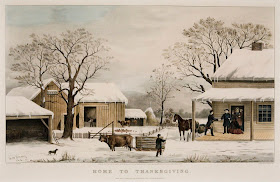
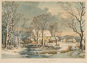
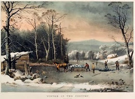
George Henry Durrie (June 6, 1820-Oct. 15, 1863) was the artist for ten of what are some of the most popular Currier & Ives prints. Durrie was born in Hartford, Connecticut, and both he and his brother John (1818-90) studied with engraver and portrait painter Nathaniel Jocelyn. Early in his career, Durrie painted mostly portraits in the New Haven area, but around the middle of the century he started to paint genre scenes, specializing in winter scenes. Nine of these winter scenes were turned into lithographs by the New York popular print publishers, Currier & Ives.
Durrie’s winter scenes are quintessential American images. He used soft, appealing colors and his eye for the details of American rural homes and farms of the period added an authenticity to the paintings. His fame grew and he exhibited at institutions such as the National Academy of Design. In 1861, Currier & Ives firmly established his reputation by publishing two of his winter paintings, “New England Winter Scene” and “Farmyard in Winter,” as large folio, hand-colored lithographs. They published two more in 1863, “The Farmer’s Home – Winter,” and “Winter Morning. Feeding the Chickens,” and then six more after his death that year. These include “Winter in the Country. Getting Ice,” “Winter in the Country. A Cold Morning,” “Winter in the Country. The Old Grist Mill,” “Home to Thanksgiving,” “The Old Homestead in Winter,” and the non-winter scene “Autumn in New England.”
Winter scenes are generally the most popular Currier & Ives prints. For instance the #1 print in the New Best 50 large folio Currier & Ives list (as voted by the AHPCS, cf. blog on most popular Currier & Ives prints) is “The Road – Winter,” and the first three prints in the New Best 50 small folio Currier & Ives list are winter scenes. All ten of the prints made after Durrie’s paintings are large folio and seven of them were voted into the New Best 50 list (five of these were included in the Original Best 50 list).
The popularity of Durrie’s winter paintings goes beyond the original Currier & Ives prints, for it is these images which are most often used when people want to use a “classic” Victorian scene. Durrie’s pictures appear in a multitude of instances on Christmas cards, calendars, posters, plates, wastebaskets, boxes, purses, and in every other imaginable chachka that one can imagine. It is usually a Durrie painting that comes to people’s mind when they think of an American winter in “olden times.” Looking out my window today, I smile and think of Durrie and his marvelous work.
Tuesday, February 9, 2010
Putting on Hairs: A political print and Lincoln's beard
On February 16, 1861, Lincoln's train stopped at Westfield, N.Y. on the way from his home in Springfield, Illinois to his inauguration in Washington, D.C. During his remarks to the crowd that had gathered, Lincoln mentioned that he had received a letter from a young girl who lived in Westfield and asked to meet her. This letter was written during the presidential race the prior autumn by 11 year old Grace Bedell.
Lincoln was obviously touched by the letter and replied just a few days later:
Despite his demurring to her suggestion, within a few weeks Lincoln began to grow a beard. While Grace's letter was likely not the sole reason Lincoln decided to become bewhiskered, it seems likely that it had some influence on this decision. What is interesting to me is that Grace was prompted to write her letter after viewing "[Lincoln's] picture and Mr. Hamlin's" which her father had acquired at the Chautauqua County fair.
It has been determined that the print which spurred Grace to write to Lincoln was H.H. Loyd's "National Republican Chart. Presidential Campaign 1860." This is an 3' x 2' hand-colored wood engraving which included the Republican platform, quotes from Lincoln's speeches, demographics, a map of the United States, and portraits of the first fifteen presidents. In the pride of place are portraits of Lincoln and his running mate Hannibal Hamlin, each surrounded by a rail fence. Grace liked the fence ("I think that rail fence around your picture makes it look very pretty.") but obviously thought the portrait of Lincoln with his almost cadaverous face indicated he needed a cosmetic makeover.
What is cool about this is here is an example where a popular print seems to have had a significant impact on history, even if only on a presidential coiffure. And even if Grace's letter had only a tangential impact on Lincoln's decision, certainly this episode is a nice example of how popular prints had a great impact on the general population. As Holzer, Boritt and Neely state in The Lincoln Image, this is "indicative of the importance such images held for the picture-hungry society of the 1860s" (p. 73)
Oct 15. 1860
Hon A B Lincoln
Dear Sir
My father has just home from the fair and brought home your picture and Mr. Hamlin's. I am a little girl only eleven years old, but want you should be President of the United States very much so I hope you wont think me very bold to write to such a great man as you are. Have you any little girls about as large as I am if so give them my love and tell her to write to me if you cannot answer this letter. I have got 4 brother's and part of them will vote for you any way and if you will let your whiskers grow I will try and get the rest of them to vote for you you would look a great deal better for your face is so thin. All the ladies like whiskers and they would tease their husband's to vote for you and then you would be President. My father is a going to vote for you and if I was a man I would vote for you to but I will try and get every one to vote for you that I can I think that rail fence around your picture makes it look very pretty I have got a little baby sister she is nine weeks old and is just as cunning as can be. When you direct your letter dir[e]ct to Grace Bedell Westfield Chatauque County New York
I must not write any more answer this letter right off
Good bye
Grace Bedell
Lincoln was obviously touched by the letter and replied just a few days later:
October 19, 1860
Springfield, Illinois
Miss. Grace Bedell
My dear little Miss.
Your very agreeable letter of the 15th. is received.
I regret the necessity of saying I have no daughters. I have three sons -- one seventeen, one nine, and one seven, years of age. They, with their mother, constitute my whole family.
As to the whiskers, having never worn any, do you not think people would call it a piece of silly affection if I were to begin it now? Your very sincere well-wisher
A. Lincoln
Despite his demurring to her suggestion, within a few weeks Lincoln began to grow a beard. While Grace's letter was likely not the sole reason Lincoln decided to become bewhiskered, it seems likely that it had some influence on this decision. What is interesting to me is that Grace was prompted to write her letter after viewing "[Lincoln's] picture and Mr. Hamlin's" which her father had acquired at the Chautauqua County fair.
It has been determined that the print which spurred Grace to write to Lincoln was H.H. Loyd's "National Republican Chart. Presidential Campaign 1860." This is an 3' x 2' hand-colored wood engraving which included the Republican platform, quotes from Lincoln's speeches, demographics, a map of the United States, and portraits of the first fifteen presidents. In the pride of place are portraits of Lincoln and his running mate Hannibal Hamlin, each surrounded by a rail fence. Grace liked the fence ("I think that rail fence around your picture makes it look very pretty.") but obviously thought the portrait of Lincoln with his almost cadaverous face indicated he needed a cosmetic makeover.
What is cool about this is here is an example where a popular print seems to have had a significant impact on history, even if only on a presidential coiffure. And even if Grace's letter had only a tangential impact on Lincoln's decision, certainly this episode is a nice example of how popular prints had a great impact on the general population. As Holzer, Boritt and Neely state in The Lincoln Image, this is "indicative of the importance such images held for the picture-hungry society of the 1860s" (p. 73)
Thursday, February 4, 2010
Most popular Currier & Ives prints
The latest issue of Imprint came out recently and among its excellent articles is one entitled "What Currier & Ives Prints Were Most Popular in the Nineteenth Century?" Written by my friends John Zak and James Brust, this article and related topics are the subject of today's blog. Before I get to that, however, I will use the publication of this article as an excuse to again put in a pitch for the American Historical Print Collectors Society, which is the publisher of Imprint.
One of my first blogs was about the AHPCS. I mentioned Imprint but didn't really emphasize what a great publication this is. It is the only journal specifically focused on American historical prints and the last issue completed its 34th year of publication! While there are many reasons to join the AHPCS, the subscription to this biannual journal is by itself well worth the $50 membership fee.
As it happens, however, this year the AHPCS is making a special offer of a reduced membership for new members for only $25. If you are at all interested in American prints, don't miss the opportunity to join at this low price and see what a great journal Imprint is. Just visit the AHPCS web site for more information. You can mention you read about this reduced membership on the Antique Prints Blog. As a further incentive (note I get nothing from promoting the AHPCS other than to support an organization I think is great), I will guarantee your satisfaction. If you join and receive your first issue of Imprint and do not think your membership was worth the $25, you can cancel your membership and send me the issue of Imprint you received, and I will personally reimburse your $25 plus the cost of mailing the journal to me. I don't think anyone will take me up on this, but I don't want any reader to hesitate if they are at all tempted to join...
So, now back to the article in question, Zak and Brust's article on what Currier & Ives prints were the most popular in the nineteenth century. What the authors do is use primary documentary evidence to try to analyze the market for Currier & Ives prints at the time they were issued. They used a series of original Currier & Ives sales lists and catalogues to see which types of prints were most often issued by the firm. The argument is that Currier & Ives (always the smart businessmen) would have issued more prints of the types which sold the best than of those which were less popular, a reasonable assumption. There are no sales records for the firm we can study, so we cannot determine how many examples of each print sold, but if a type of print was selling well, the firm would naturally issue more of that type than they issued of prints with a more limited appeal.
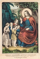
I will consider only the author's conclusions for small folio prints (there are some interesting differences for these results compared to those for medium and large folio prints) for these are particularly interesting. Their analysis shows that it was primarily juvenile, "beautiful girls," religious, sentimental, animal and domestic scenes which were the most popular. What is surprising about this is that these are among the least popular subjects today. The prints that are most popular (and thus generally most expensive) today are railroad, yachting, historical, hunting and landscapes. Those subjects, according to Zak & Brust's article, were considerably less popular than the other subjects in the nineteenth century. As they say, “It may be a surprise to the twenty-first-century collector, living in an era when Currier & Ives catholic subjects go begging in the marketplace while small folio railroad scenes sell for thousands, that in the heyday of the C&I firm, the former may have outsold the latter twenty to one.”
I found this article quite exciting to read and ponder. It is a terrific example of using prints and related documents as primary resources in order to try to understand our past. Today we look at Currier & Ives prints in light of our own world-view and obviously those purchasing prints in the nineteenth century saw them in a different light. The work that Zak & Brust have done can help us to look (at least to some extent) through the eyes of our ancestors. Zak & Brust conclude their article with these interesting thoughts:
Back in 1991, I did some similar analysis on the popularity of Currier & Ives prints. Beginning in 1988, the AHPCS decided to "redo" the Best 50 Currier & Ives prints lists which had originally been compiled in 1932-33 (the first year, the best large folio prints were selected, followed the next year by the best small folio prints). The original lists were selected by a small group of dealers and collectors and the new lists were voted on by the entire AHPCS membership. A book, Currier & Ives. The New Best 50 was published, for which I wrote an article "A Comparison of the Original and New Best 50 Currier & Ives. Some statistics and thoughts."
Most of my analysis was focused on the differences in the tastes of collectors in the early twentieth century compared to those of collectors later in the century, but I came to similar conclusions about the reason for the popularity of certain prints today:
Zak and Brust use different methodology and it is thought provoking to see them expand on these ideas and bring up new ways of understanding Currier & Ives prints, especially in the context of the period when they were issued. To some extent we are at the beginning of the serious study of "popular" prints of the nineteenth century and it is quite exciting to read articles like this and to think about all the further research that can and will be done by scholars like Zak and Brust (and much of which will appear in future issues of Imprint).
One of my first blogs was about the AHPCS. I mentioned Imprint but didn't really emphasize what a great publication this is. It is the only journal specifically focused on American historical prints and the last issue completed its 34th year of publication! While there are many reasons to join the AHPCS, the subscription to this biannual journal is by itself well worth the $50 membership fee.
As it happens, however, this year the AHPCS is making a special offer of a reduced membership for new members for only $25. If you are at all interested in American prints, don't miss the opportunity to join at this low price and see what a great journal Imprint is. Just visit the AHPCS web site for more information. You can mention you read about this reduced membership on the Antique Prints Blog. As a further incentive (note I get nothing from promoting the AHPCS other than to support an organization I think is great), I will guarantee your satisfaction. If you join and receive your first issue of Imprint and do not think your membership was worth the $25, you can cancel your membership and send me the issue of Imprint you received, and I will personally reimburse your $25 plus the cost of mailing the journal to me. I don't think anyone will take me up on this, but I don't want any reader to hesitate if they are at all tempted to join...
So, now back to the article in question, Zak and Brust's article on what Currier & Ives prints were the most popular in the nineteenth century. What the authors do is use primary documentary evidence to try to analyze the market for Currier & Ives prints at the time they were issued. They used a series of original Currier & Ives sales lists and catalogues to see which types of prints were most often issued by the firm. The argument is that Currier & Ives (always the smart businessmen) would have issued more prints of the types which sold the best than of those which were less popular, a reasonable assumption. There are no sales records for the firm we can study, so we cannot determine how many examples of each print sold, but if a type of print was selling well, the firm would naturally issue more of that type than they issued of prints with a more limited appeal.
I will consider only the author's conclusions for small folio prints (there are some interesting differences for these results compared to those for medium and large folio prints) for these are particularly interesting. Their analysis shows that it was primarily juvenile, "beautiful girls," religious, sentimental, animal and domestic scenes which were the most popular. What is surprising about this is that these are among the least popular subjects today. The prints that are most popular (and thus generally most expensive) today are railroad, yachting, historical, hunting and landscapes. Those subjects, according to Zak & Brust's article, were considerably less popular than the other subjects in the nineteenth century. As they say, “It may be a surprise to the twenty-first-century collector, living in an era when Currier & Ives catholic subjects go begging in the marketplace while small folio railroad scenes sell for thousands, that in the heyday of the C&I firm, the former may have outsold the latter twenty to one.”
I found this article quite exciting to read and ponder. It is a terrific example of using prints and related documents as primary resources in order to try to understand our past. Today we look at Currier & Ives prints in light of our own world-view and obviously those purchasing prints in the nineteenth century saw them in a different light. The work that Zak & Brust have done can help us to look (at least to some extent) through the eyes of our ancestors. Zak & Brust conclude their article with these interesting thoughts:
For the modern collector, Currier & Ives evoke romanticized images of American life in the nineteenth centry. But those who bought C&I prints at the time they were issued were living in that era, not looking back at it, and its realities were often very unromantic. Many were immigrants. Their lives included religion, family, and perhaps nostalgia for the places they had come from. These small folio buyers could have chosen the fancier or more romantic topics in that size for the same price as the religious or sentimental, but seem much less likely to have done so. Instead, they appear to have purchased the topics they were familiar with, and perhaps those that would help them feel better; the cute children, pretty women, and devotional images might well have gratified them emotionally and spiritually.
Back in 1991, I did some similar analysis on the popularity of Currier & Ives prints. Beginning in 1988, the AHPCS decided to "redo" the Best 50 Currier & Ives prints lists which had originally been compiled in 1932-33 (the first year, the best large folio prints were selected, followed the next year by the best small folio prints). The original lists were selected by a small group of dealers and collectors and the new lists were voted on by the entire AHPCS membership. A book, Currier & Ives. The New Best 50 was published, for which I wrote an article "A Comparison of the Original and New Best 50 Currier & Ives. Some statistics and thoughts."
Most of my analysis was focused on the differences in the tastes of collectors in the early twentieth century compared to those of collectors later in the century, but I came to similar conclusions about the reason for the popularity of certain prints today:
Perhaps in a world that is frantically paced, with news of worrying events constantly bombarding us from all sides, we look to Currier & Ives prints to transport us back to an earlier time of simple values. As much as any, Currier & Ives prints graphically embody this image of our past, and this indeed may be the core of their continued popularity.
Zak and Brust use different methodology and it is thought provoking to see them expand on these ideas and bring up new ways of understanding Currier & Ives prints, especially in the context of the period when they were issued. To some extent we are at the beginning of the serious study of "popular" prints of the nineteenth century and it is quite exciting to read articles like this and to think about all the further research that can and will be done by scholars like Zak and Brust (and much of which will appear in future issues of Imprint).