Thursday, September 30, 2010

Philadelphia Print Shop West

Despite my best intentions, I have just been too swamped with all the things involved in setting up the new shop in Denver to be able to write any blog postings. Next week I should be able to get have a print related post, but just to get something up, I'll give a brief report on my efforts here in Denver.


We got into our new space at the beginning of September. It is a terrific space located in the Cherry Creek North section of Denver (2819 E. 2nd Ave). The previous tenant left their "slat wall" system, which isn't really our "ye olde printe shoppe" style, but it is very versatile and will work fine.


The first week or so I had to clean out the stuff that was left, get some furniture in the shop, get the walls painted, etc. etc. Then Jon arrived with the initial shipment of inventory from Philadelphia. Jon had taken our "Denver" inventory to an antique show in Minneapolis and then drove on to Denver. Long drive for Jon, but now I have inventory!

The next few weeks will involve getting print racks, plan files, unpacking and getting things ready for our grand opening. As I will be exhibiting at the San Francisco Antiques Show in late October, our grand opening won't be until November 13th. If anyone is in the Denver area, I hope you will stop by! Or if anyone has any questions about the new shop, feel free to call the new shop number at (303) 322-4757.

Tuesday, August 17, 2010

Fun with maps of the American West

The Philadelphia Print Shop has always carried maps of the American West and we have done a reasonable business in them, acquiring and selling many of the great nineteenth century maps of that region. However, I have never studied what the maps showed specifically of the American West, really looking at what they depicted. I studied the maps as historical documents, but not as physical objects. Now that I am about to head out to live and open a shop in Denver (I leave Philly in just under two weeks!), I have started to look at these maps more closely and boy am I having a blast!

As I have written before, new cartographic information on maps is often what makes them specially interesting and valuable. The first depiction of a particular place, changing political borders, new discoveries of mountains and rivers, or corrections of previous mistakes are the stuff that make map collectors drool. I am trying to learn more about the geography of the American west and as I now closely study the maps we have in stock I am finding all sorts of fun things I was unaware of before. I plan to write a number of blogs on this subject (as I think it is pretty cool), and today I am going to use the example of four unprepossessing maps of North America from the mid-nineteenth century.


These are quite small maps that probably have been sitting in our map drawers for over a decade, pretty much just ignored. They were all issued in different nineteenth century geographies, the type of geographies that were probably intended for students. They are small maps, are colored only in broad sections by country, and frankly, before I decided to move to Denver, I pretty much thought they were an uninteresting 'much or a muchness.'

I am trying to learn about the history of the mapping of my new home, Denver, which is located between the vast plains and the steep Rocky Mountains. The junction of Cherry Creek and the south branch of the Platte River was a place where Indians and trappers had camped for years and with the discovery of gold there in 1858, several towns soon appeared, which morphed into Denver within a short time. Colorado Territory was formed in 1861 and Denver became a major western town by the 1870s.

The earliest maps of the region around Denver show the Platte River and usually Cherry Creek, though the latter is often not named. Denver is located a bit southeast of Long's Peak and a bit northeast of "Pikes Peak." If you look on a map for the south branch of the Platte River and those two mountains, you can hone in on the location that would eventually become Denver. I started doing this for almost every map we have from the mid-19th century and it was by doing this that I discovered these four geography maps are a lot more interesting than I thought!


The earliest of the four is from Roswell C. Smith's A Precise and Practical System of Geography, published by Burgess & Co. in 1853. As you can see from the detail above, it does not have a lot of information on the Denver area and some of that is incorrect. It does show Longs Peak and Pikes Peak, but the latter is here identified as "James Peak," a name that was sometimes used for Pikes Peak until the name became attached to the present-day James Peak. It does show the southern branch of the Platte River (which is identified by this name), but rather than curling south along the foot of the Rockies, it is depicted as running straight west between the two indicated peaks.

The other interesting thing about this map is that it shows the "American Desert." This was a description given in the early nineteenth century to the “high plains” that border the Rocky Mountains to the east. “Desert” was used in the sense, common at the time, of a treeless area unfit for cultivation. Early explorers were unimpressed with the high plains. Zebulon Pike put a legend on his map that the region had “not a stick of timber,” and Stephen Long’s 1823 map labeled the area the “Great American Desert,” the accompanying report from his expedition stating that the region “is almost wholly unfit for cultivation, and of course, uninhabitable by a people depending upon agriculture for their subsistence.”


The next map was issued about 1858 by S. Augustus Mitchell, a leading American map maker and probably the largest publisher of school geographies of the period. 1858 was, of course, the year that gold was discovered in Denver. Gold had been panned in the South Platte River as early as 1849 to 1850, but it wasn't until 1857 and 1858 that significant gold was found near Denver, precipitating the Colorado Gold Rush what would last until about 1861, with an estimated 100,000 gold prospectors participating (their slogan was "Pike's Peak or Bust!"). Here, on a map issued just at the beginning of the Gold Rush, Mitchell marks the location in capital letters as "GOLD REGION." The Platte (here called the "Nebraska River") meanders to an end right in the Denver area.


The next map was also issued by in a Mitchell publication, Mitchell's New Intermediate Geography, but this one published by J.H. Butler in Philadelphia in 1875. By 1875 a lot had happened in the Denver region, but this map shows no new information, other than the heights of Longs and Pikes Peaks and the modification of the course of the Platte, which has now been extended further and more southerly. I think this was somewhat typical of the maps published in student geographies; there was little care to keep them very up-to-date, it being cheaper to simply reissue the same map year after year.

The last of these four maps is undated and has no publisher, but it is very similar in size and style and coloring to the other four maps. Our best guess for a date is about 1870, and here for the first time on one of these geography maps is "Denver City." right besides the Platte as it correctly winds its way south along the edge of the Rockies. By 1870, the railroads finally reached Denver and it began to change from simply an old gold rush city to the Queen of the High Plains that it would become.

While none of these maps has any real significance for map collectors, and none of them are that impressive aesthetically (though they are all pleasant enough in appearance), they become fascinating once you start to look closely. I only studied the immediate Denver area and I am sure that there are other spots around the continent where these maps either show new information or anachronistically ignore major changes. This is just one example of the fun that can be had by studying nineteenth century maps of the American West. I plan to publish some more blogs on similar topics in the not too distant future.

Thursday, August 12, 2010

"What the experts collect"

I was recently contacted by the folks at AmeriCollector.com, a blog on "events, news and information for collectors of all stripes." I had not run across the blog before, but looked it over and was pretty impressed. As I have mentioned before, I not only work with a lot of collectors, but I am a collector myself. This blog has a series about "what the experts collect," and they asked if they could interview me about my wife's and my collections, and I was happy to do it. As I have said, this summer is a crazy time for me so I am going to just copy the interview into my own blog. This is a bit cheeky (and I did ask them if it was ok), but I thought you all might be interested.... (It is worth visiting AmeriCollector.com and you can see the original interview there)...

AmeriCollector: It always amazes me that people would buy some mass-produced framed print or some other tacky reproduction from a department store instead of getting a genuine old print – even an attractively designed book page or an illustration from an old newspaper – and having it framed, preferably with preservation materials (acid-free matting, conservation glass – the subject of an upcoming AmeriCollector.com story). Even though there’s a multitude of beautiful images and typographical examples available in a wide price range – with many beautiful engravings and chromolithographs costing not that much more than a print from Target – some folks would rather decorate their homes like a Motel 6 than put a little piece of history on their wall. Go figure.

An old print or poster makes a fantastic gift as well, and if skillfully framed can become the centerpiece of a room, more furniture than accouterment. Having a print (or photo or document, like a vintage stock certificate) custom framed can be pricy – and may even cost more than the print itself, especially if you have it done with the archival materials, which you should – but my motto is: If it’s worth framing, it’s worth framing right. Believe me, there’s a world of difference between a beautiful print that’s beautifully framed and one that looks like your kid framed it in arts & crafts at summer camp.

It’s also a lot of fun selecting an old print, especially if you want an image that connects to your or a loved one’s collection. Sometimes that just means riffling through old magazine ads to find one for Harley-Davidson if your boyfriend’s other passion is his hog, or an old “Police Gazette” engraving of a twelfth-round knockout if Uncle Rocky is an ex-pug. Of course, if you dream big - a long rail journey to Istanbul or a passage to India, perhaps – an old travel poster in your living room or home office will keep you focused and on course.

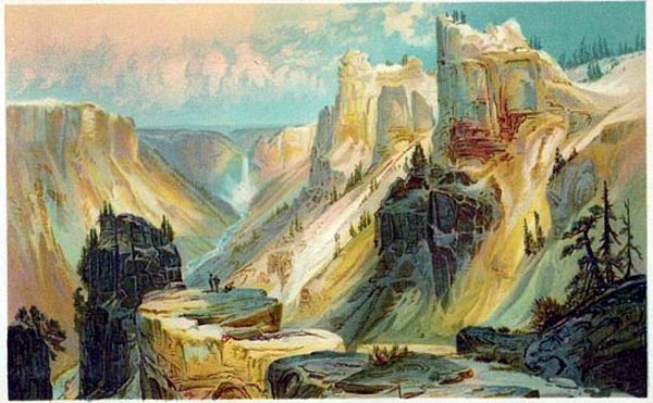
Prints can really make a statement: who you are, where you want to go …

However, I’m just a casual print collector: What does a bona fide print maven – a print professional – collect? I asked “Antiques Roadshow” appraiser Christopher Lane, co-owner (with Donald H. Cresswell) of The Philadelphia Print Shop (www.philaprintshop.com), who I introduced in my last post and who will open The Philadelphia Print Shop (West) in Denver in October, about his love of prints …

AmeriCollector: What do you primarily collect?

Chris Lane: I got into this field because of my interest in maps. I was a graduate student in philosophy and went looking for a map to give to my sister as a wedding gift. The dealer I bought the map from offered me a job and so I took a break from my thesis to work for a year and learn as much as I could about old maps. I got hooked and at the end of the year decided to start my own business, which I did in 1982 with my partner, Donald H. Cresswell.

I have always had a bit of the collector bug and of course had to collect antique maps. Because I didn’t want to compete with my clients – partly because it wouldn’t be fair to Don – my wife, Lindsey, and I decided to collect maps of the British Isles and Oxfordshire. I had met Lindsey when studying at Oxford (she is British) and so this was a natural thing for us to collect and a subject for which there were not a lot of American collectors.

Early on we both got interested in American ornithological prints, particularly through the wonderful prints of Mark Catesby. Our first non-map was the Catesby “Blue Heron” and now we have nice examples by almost every naturalist who made prints of American birds.

AC: What do you enjoy about collecting maps and prints?

Chris: The thing I enjoy most about collecting – other than the thrill of the chase – is that in building a collection one builds a graphic history of the topic you collect. My background is not at all in art; it is in history. While I primarily studied philosophy, history was always a “minor” in my studies. I found that I was able to envision history, and remember it, much better when I had contemporary images, prints and maps, of the subject I was studying. When you put together a collection of prints or maps of a particular place, you can visually see the history of the place: the changes in society, the physical structure, the economy and pretty much everything else. Then when you read about a period of history, you have an image in your mind that you can hang the text on and that really broadens your appreciation and understanding of that history.

AC: How do you build your collection?

Chris: Probably the thing that Don and I spend most of our time on here at the shop is buying inventory. It is relatively easy to sell when you have good items – the problem is finding those good things. So in our constant hunt for good inventory we regularly come across things that fit my collecting interest. We do most of our buying privately, but we also buy from other dealers and a little (probably about 5 percent of our inventory) at auction.

AC: What do you look for when choosing a new map or bird print to your collection?

Chris: I look for items that will fill in “gaps,” mostly by date, but also in trying to have items by all the major print or mapmakers who made items that fit our area of collecting. Also major items, even if I have other things that are similar, and those items that are “special” in some other way – such as a map that was particularly well colored at the time. Sometimes, though, we’ll buy something simply because we like it, mostly when it makes us smile to look at it, whether it is important or not. We are always concerned about condition, but if the item is rare enough, we’ll add it to our collection, hoping that maybe someday we’ll be able to upgrade.

Price is rarely a consideration. Now, of course I do have an advantage at usually being able to buy at “wholesale,” but it still costs me money when I add something to our collection, as I have to make good with my partner. If there is a map or print that fits our criteria and is something that should be added, unless the price is totally out of line, I’ll go for it, even if I think the price is too high. In the long run, I will be far unhappier if I pass it up than that I paid a bit too much. I have seen that many times with collectors I have worked with, and while I usually warn them (of course, they think I’m just trying to make a sale), usually a collector doesn’t learn that lesson until they pass something up that was “too expensive,” only to regret it the rest of their collecting days.

AC: Is there a “holy grail” that you’re trying to find?

Chris: I would love a nice example of the George Lily map of the British Isles, first drawn in 1546. The “holy grail” for maps of Oxfordshire is the map from Christopher Saxton’s atlas of 1579. I have a wonderful example of that with original color which I found at an auction in Ohio and was able to buy for $200! I heard about the auction — that it had some British maps — and got a list, which included an unidentified map of Oxfordshire. From the description I recognized it as the Saxton map and after talking to the auctioneer on the phone I became convinced it was an original with original color, though it was laid to a backing. I didn’t want anyone to realize what it was, so I just asked the auctioneer if I could bid on the phone for a number of the British maps. I had decided I would pay as much as $5,000 for the Saxton, but bidding started at $50. When it got up to $200 I didn’t hear anything more. I was terrified the person on the phone might have missed a bid, so I kept saying, “Am I still high bidder?” Finally, I was assured not only was I high bidder but that I had won the map. As a business, The Philadelphia Print Shop has had a few great buys like that, but it was particularly fun that this time it was for me personally!

AC: Any advice for collectors of prints and/or maps?

Chris: The most important thing to me is for a collector to focus on a theme for the collection. Without a theme, it will just be a “group” of prints or maps, not a collection. The theme is what gives form and coherence to the group, making it a collection. The theme can be anything you are interested in: a time period, a style; prints showing canoes, maps of a particular place, presidential prints or whatever. Make it something you like and the collection will have meaning.

The next most important thing is to educate yourself. Learn how prints and maps were made and in what form they were issued so that you can recognize an original (we still find reproductions being sold as originals in some of the major auction houses!). Also, learn about the history of whatever theme you have chosen; this will help you appreciate those items you have and also to learn which items are important to your collection and which aren’t. Also, learn what is out there within the scope of your collection and how rare or important things are. That will help you decide whether to get something, even if you have to pay a premium or it isn’t in great condition.

Wednesday, August 4, 2010

A few degrees of separation


Sherlock Holmes and John James Audubon? How would these two be connected. Well, a member of the Yahoo Audubon prints group made an interesting post earlier this week explaining how...

The prints by John James Audubon, especially his large, double elephant folio bird prints, are among the most famous and popular of all antique prints. There is a fairly active Yahoo mailing list that is dedicated to Audubon and his prints. If you are interested in this subject, it is well worth joining on the Yahoo site. It is easy to join, and of course free.

In any case, Rama, a member of this group, made the following rather interesting post on Monday...

"...I was watching an old B&W Sherlock Holmes movie on the TV and in the credits I noticed that the actor who played the famous detective was a guy by the name 'Basil Rathbone.' His last name immediately caught my attention because Audubon visited a Richard Rathbone in Liverpool/England after leaving New Orleans, and even honored him by naming a warbler after him (Havell Plate #65 [image above]). After some digging, this is what I found - - Richard Rathbone's (1788-1860) elder brother William Rathbone V (1787-1868) was the great grand father of Basil Rathbone (1892-1967) who made a name for himself by playing Sherlock Homes in the 1940's era movies."

[Here is a link to the Rathbone family tree]

Any one else know of any connections between actors and antique prints?

Monday, August 2, 2010

Enthusiasm and life

Yesterday evening, my "favorite uncle" Charles Rand Penney died. This was quite a shock, coming just seven months after the passing of my father, and a mere two months after the death of my mother, his sister Virginia Penney Lane. Uncle Charlie was quite a remarkable man and I wrote a post in this blog about him just about a year ago. I am incredibly sad, but I am also grateful that I had Charlie as my uncle and was able to get to know him and love him over the last 30 years. Interestingly, our relationship was built on our shared interest in antique prints.

Charlie was probably the most enthusiastic, curious, and dedicated collector I have ever met. I got into the business I am in because of my enthusiasm for original graphic depictions of history. I did not learn my enthusiasm from Charlie, but we certainly shared that and I am convinced it runs in the Penney blood. What I did learn from Charlie is what can be done if one takes ones enthusiasm and channels it with focus and dedication.

Charlie at one stage had 100 collections, and while he spent the last decade or so deaccessioning so that he could find appropriate, lasting homes for his collections, he never lost his love of what he was doing. Until his health slowed him down, Charlie used to do everything himself. He had files on everything and everyone he came in contact with, he collected books and archives related to his collections, and he even lived in the midst of his statues, furniture, paintings, prints, Mr. Peanut memorabilia, and wooden hotel hangers!

Some of his collections were not terribly impressive, but others were absolutely world class. Charlie was interested in almost anything he came across and he probably would have collected a little of everything if he could. Charlie always brought enthusiasm, interest, and a willingness to invest to all his collecting; sometimes he needed a bit of focus and discipline and that is where our relationship bloomed.

I like to think that our relationship vis-a-vis his collecting was something that benefited both me and him. Obviously I had known Charlie all my life and he was always an interesting figure. Rather exotic and unusual, but always fun to be with and talk to. When I studied in Oxford, Charlie came to visit and that was when as an adult I first really got to know him. I told him how I was getting interested in old maps and prints. Charlie encouraged me and told me how he had quite a number of old prints in his collections.

Then when I went into business, he approached me about helping him improve his collection of antique prints. At that stage he had a lot of prints, mostly showing scenes in western New York, from Rochester to Niagara Falls. Some were in good shape, some not so much; some were in their "original state," others with new color added. I talked to him about how he should really focus on one particular topic (he chose Niagara Falls) and how he should use a series of criteria for what he would accept in his collection (for instance, avoiding "new" colored prints where possible).

Together we spent over a decade expanding and refining his collection of Niagara Falls prints. We got rid of the prints that didn't meet his new criteria and looked for better examples. We used references to build a list of what prints were out there and tried to acquire the most important ones. Whenever I came across a Niagara print not in his collection, Charlie would always agree to add it--rather of a dream for a printseller!

Soon it became apparent that his collection was the best there was on Niagara Falls prints; better than that in the Erie County Library, the Erie County or Niagara Falls Historical Societies, or even the Library of Congress. I also called to his attention that while there were a number of good books on Niagara Falls images and prints, there was no really exhaustive work that tried to document the entire scope of printed views of the Falls. So, with his typical enthusiasm, Charlie gave me the go ahead to write a book and even plan an exhibition on the topic from prints in his collection. After many years collecting and research, Impressions of Niagara. The Charles Rand Penney Collection opened in the summer of 1993 at the Castellani Art Museum of Niagara University. This was certainly one of the highlights of my professional life and I know also of Charlie's collecting.

To be able to share our enthusiasm and dedication together and produce something as worthwhile as that exhibition and the accompanying catalogue was a great thing. It showed me what was possible and it bonded us together in a lasting relationship, which unfortunately yesterday I lost. I think I carry my enthusiasm and dedication for antique prints and maps with me every day and while some of that I was born with, without doubt it is the model of Uncle Charlie which gives me a constant reminder that this is the way one should approach one's life. Charlie did not waste his time in the world; every day he got the most out of life that he could. He, I and everyone who knew him was enriched by this remarkable life. Thanks Uncle Charlie.

Monday, July 19, 2010

Some thoughts on print values

Despite my intent, I have failed to make regular posts to this blog over the last couple of months. My excuse is that not only that I am in the midst of a move of my home and work from Philadelphia to Denver, but with the recent death of my mother, I have been swamped with personal matters. I have to confess that print thoughts have been pushed to the back of my mind since the end of May. I am finally beginning to get back on top of things and so plan (and hope) that I'll be able to make posts on a more regular basis here-on-in. In order to get at least one post done, I thought I'd just ramble on a bit about some thoughts I have an issue that comes up in queries about antique prints we get all the time: their value.

Through this blog, from our regular web site, and from our appearances on Antiques Roadshow, we get dozens of calls and emails each day with print questions. I would say that at least 80% of these have to do with the value of prints owned by the person contacting us. While I do understand this, it still is something that wears on us and is certainly less interesting than someone asking about the history of a map or the meaning of an obscure political cartoon. It is almost always the value of prints that people seem to want to know about.

One of the sources for this preoccupation with value is, of course, Antiques Roadshow, which Don and I have been appraisers on for more than a decade. Everyone who watches this program remembers the blockbuster items with huge prices. This seems to have raised everyone's expectations for the value of what they own. When we first went into business, if we offered $100 for a large historical engraving that we would sell for $250 after fixing up, the owner was usually surprised they could get that much. Today, if we offer $200 for the same print (which now after restoration would probably sell for about $500), they look at us like we are trying to cheat them. "I saw one just like this last week on Antiques Roadshow and it was valued at $3,000!

Of course the print on the program was quite different, but everyone's expectations have been raised and a lot of people tend to think their print is one of those very valuable ones. Soon I will make a post about the Roadshow stop in Billings, MT earlier this month and I will discuss the issue of values on Antiques Roadshow then, but suffice it to say here that this show has definitely raised everyone's awareness of the potential value of antiques of all sorts, including prints.

The thing we run up against vis-a-vis prices and antique prints is that relative to most types of antiques, prints and maps--for the most part--are not things that bring large prices. Most of the prints and maps we sell are priced between $300 and $1,500; this is no tiny amount, but relative to most antiques it is fairly low market. The "best" things we see tend to be in the $3,000 to $5,000 range and many very fine prints and maps we sell are in the mid-hundreds. This does not seem to impress many of the people focused on value of prints, so all the time I am finding I am being enthusiastic about a print someone asks me about where they are disappointed that their print is worth "only" $400. (Of course, this is when someone asks us about a print they own; if we are selling a print for $400, all of a sudden the question is raised about how it could be worth so much...)

Why is it that antique prints and maps tend to be in the lower range of prices in the antiques world? There are a number of reasons for this. First and foremost is that prints are, by their nature, multiples. For many antiques, each item is hand made, whereas prints and maps are usually printed off in relatively large numbers by a mechanical process. The matrix used to print the image is made by hand, but after that the process is less "hand-done." Many antique prints are very scarce now, but there still are usually a good number around.

The most desirable Currier & Ives print would just break six figures in price, but most of their prints are valued well under this despite their iconographic importance and the great demand for them. These prints were originally run off in the thousands and some of them are still relatively common, which keeps value of Currier & Ives prints reasonable even though they are as desirable antique prints as there are.

There are a number of other reasons that antique prints tend to be at the lower end of the value scale. One of these is the fact that to really appreciate the value of a print, you usually have to know the history of it. Prints tend not to "show" their value on the surface. Yes, the double elephant folio Audubon prints are big, bold, and beautifully made, which explains why they are some of the most expensive antique prints there are. However, compare these to the natural history prints by Mark Catesby. The Catesby prints are medium sized, somewhat crudely etched and drawn, and just don't "look" that valuable. To me, however, they are the most desirable of all American natural history prints. The same type of thing affects political cartoons, allegories, etc., where if you do not understand them, you cannot really appreciate their value.

This is one of the reasons why the publication of a book on a particular topic can be a big factor in helping to raise the awareness of the importance and thus value of certain prints and maps. For instance, we found that once we published Impressions of Niagara in 1993, the prices of some of the more important, though not necessarily visually impressive prints went up significantly. Our shop has always based our selling philosophy on educating our clients about the history of the prints in our inventory; this not only is something we believe in philosophically, but it also helps our business.

Another reason print prices tend to be fairly moderate is the fact that the vast majority of prints--both modern and antique--were issued specifically as decoration. Most people cannot afford original watercolors and oils for all their decorating needs and prints have always played the role of providing an affordable way for people to decorate their homes and work places. There is nothing at all wrong with this, as most people have a need for affordable decoration, but it does mean that the majority of prints are by nature going to have only "decorative" value.

The moderate value of prints is something I am perfectly happy with. It allows us to have a large inventory of material that I think is great but which is also affordable for most people Sure, I love to sell an expensive Audubon heron, Currier & Ives large folio winter scene or landmark American map, but it is more important to me that what we sell in any price range is appreciated for what is is. I think basically all antique prints and maps are great if appreciated for what they are and that is my main goal in this business, to facilitate that appreciation.

My main frustration when people ask about the value of their prints is when they are disappointed that their prints are not worth more. I guess it is human nature, but it is nice when people are turned on to their prints not because of their value, but because of their history.

Friday, June 25, 2010

New season of Antiques Roadshow

I am sitting in a hotel room in Billings, Montana, just about to head off for the appraisers meeting for the second stop on this summer's Antiques Roadshow tour. Earlier this month, my partner Don Cresswell went to San Diego for the first stop. He saw the usual mix of good and bad items and was taped with a terrific map. I hope you will all be able to see this taping when the 2011 Antiques Roadshow series runs, beginning next January.


I arrived in Billings yesterday and was able to visit the Battlefield of Little Bighorn, which was quite a fascinating and moving experience. It was exciting and enlightening to see the actual site and get a good idea of the actual events (the National Park Service does a terrific job with exhibits and signs, etc.) of this legendary episode in the sad history of the relationship between the United States and Native Americans.

This battle was almost immediately obscured by myths that developed around Custer and the events which transpired exactly 134 years ago today. Part of the myth making, of course, came through the propagation of prints of the battle. As I have written a number of times in this blog, the relationship between actual events and the way they are depicted in prints, as well as the impact that prints have on history are subject that I am particularly interested in. I plan to write a blog soon on the subject of printed images of the Battle of Little Big Horn.

On that subject, there is one print, or more specifically a series of prints, of the battle which are more common and had more influence than any other. Those are the prints that were issued by Anheuser-Busch as advertisements for Budweiser beer. I would be very surprised if any reader of this blog has not seen this famous image somewhere, even if not one of the original prints. The print was first issued in 1896 but was revised and continued to be used to as late as 1962. The earlier examples have quite a bit of value, whereas the later ones do not. This is one print I would love to see come in tomorrow at the Roadshow, for it has a very interesting history and is graphically terrific.

So what else might come in for me to see tomorrow? As I wrote last year, I enjoy trying to guess what I might see. Even though Billings is quite a small city and not surrounded by a very large population base, I could see some unusual things. I would expect I might see some good folding maps, as these were often used by those who traveled out to this part of the world in the second half of the nineteenth century. There might be some interesting views of western settlements or perhaps nearby Yellowstone, such as the great series of prints by Thomas Moran.

There also could be some good western art. Most of what we think of as "western art" is more recent than the 19th century. At that time, the west was not as glamorous as it later came to be; it was a rough and dirty and primitive life out here and not many of the general public wanted images of that life nor were there many artists out here making prints of it. There are some good prints done, however, and I hope I might get to see a print by some of the work of, say, Karl Bodmer or George Catlin.

I'll write up a report of my experience next week and with luck you'll get to see one treasure that comes in when the 2011 season runs...